
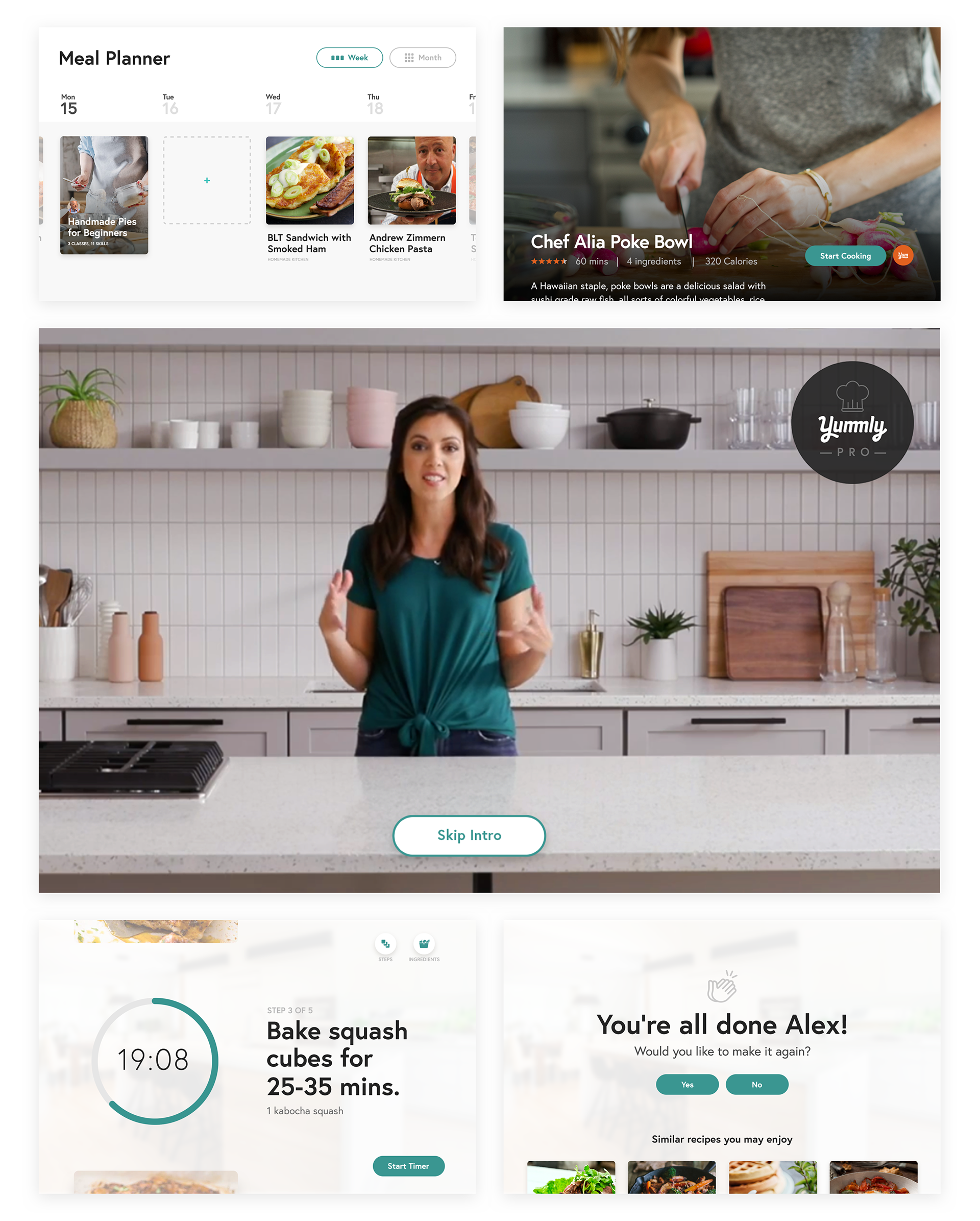
Yummly Pro is a step-by-step guided cooking platform on Yummly that teaches you how to cook alongside pro chefs; all at your own pace.
Subscribed users with a variety of cooking goals can develop skills and build confidence in the kitchen. Whether you're working on knife skills or want to make the perfect roux, there's a chef and collection to kick off your culinary journey.

The Ask
Digital Product Design / Responsive Web Experience
Client • Yummly
ANML has long been considered an extension of the Yummly team. But a good design consultant can also say the things a client’s internal team might not be able to. We can tell their bosses the hard things they don’t want to say. In that way, an outside perspective is valuable, and for years now, leveraging that balance of mutual critique and support working directly with the leadership team daily has led us forward in many ways.
When we first announced our milestone vision of Yummly Pro at CES 2019, we didn't have the user insight & full notion it might take off. The journey so far has been about establishing recognition and brand positioning for our evolving definition of a premium Yummly service. We’ve since set out this year to ideate, test, and execute our vision of growing Yummly Pro into a badass paid experience. This year is about taking risks, and we can't afford to hold back.

My Role
With myself, and my two creative directors directly working as a true extension of the Yummly team, and the sole designers for the entire company, we have a undoubtable sense of accountability to drive results, and we're hyper focused on raising this company even higher. This case study expands on the role I play in that.
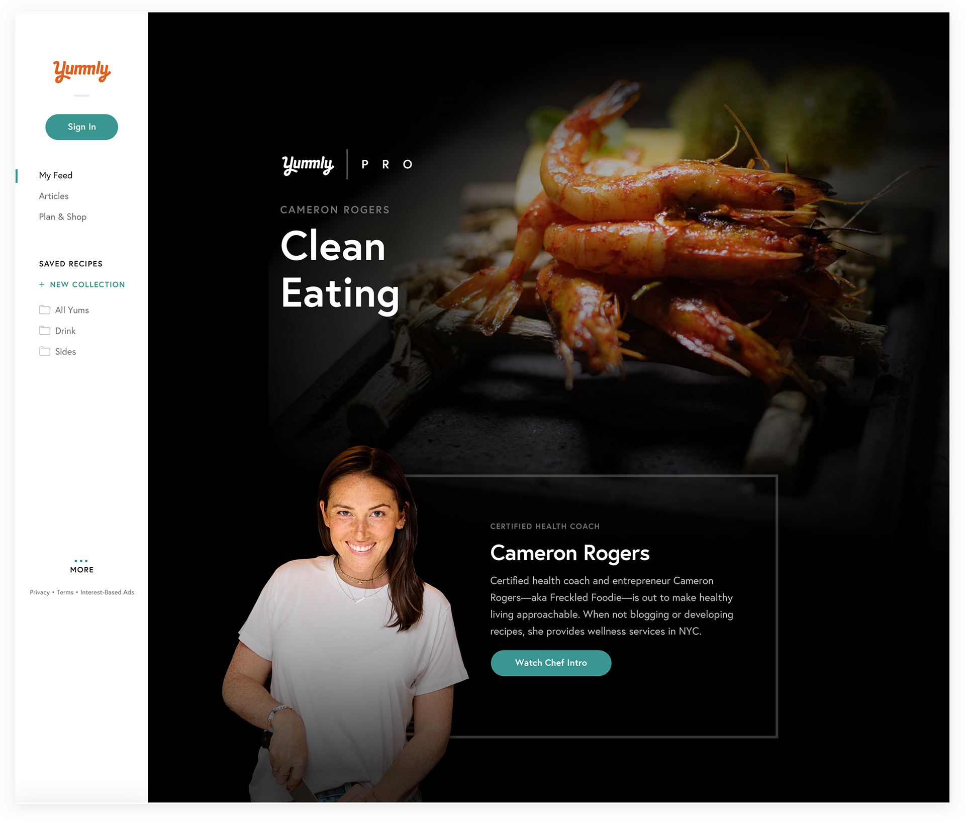
In the last few years we've cultivated a constant stream of users who care. Users who want to learn, who want to curate collections, plan meals, taste new things, and explore professional chef recipe collections. Yummly Pro can have a lot to offer, but if only we know the chefs are an important part of the pro user journey, then we have to teach users who these chefs are, and why they should care.
Areas of Responsibility:
• Strategy / Yummly vision
• Design and explicate visual language
• User experience & education
• Brand positioning / partnerships
• Design Yummly Pro content
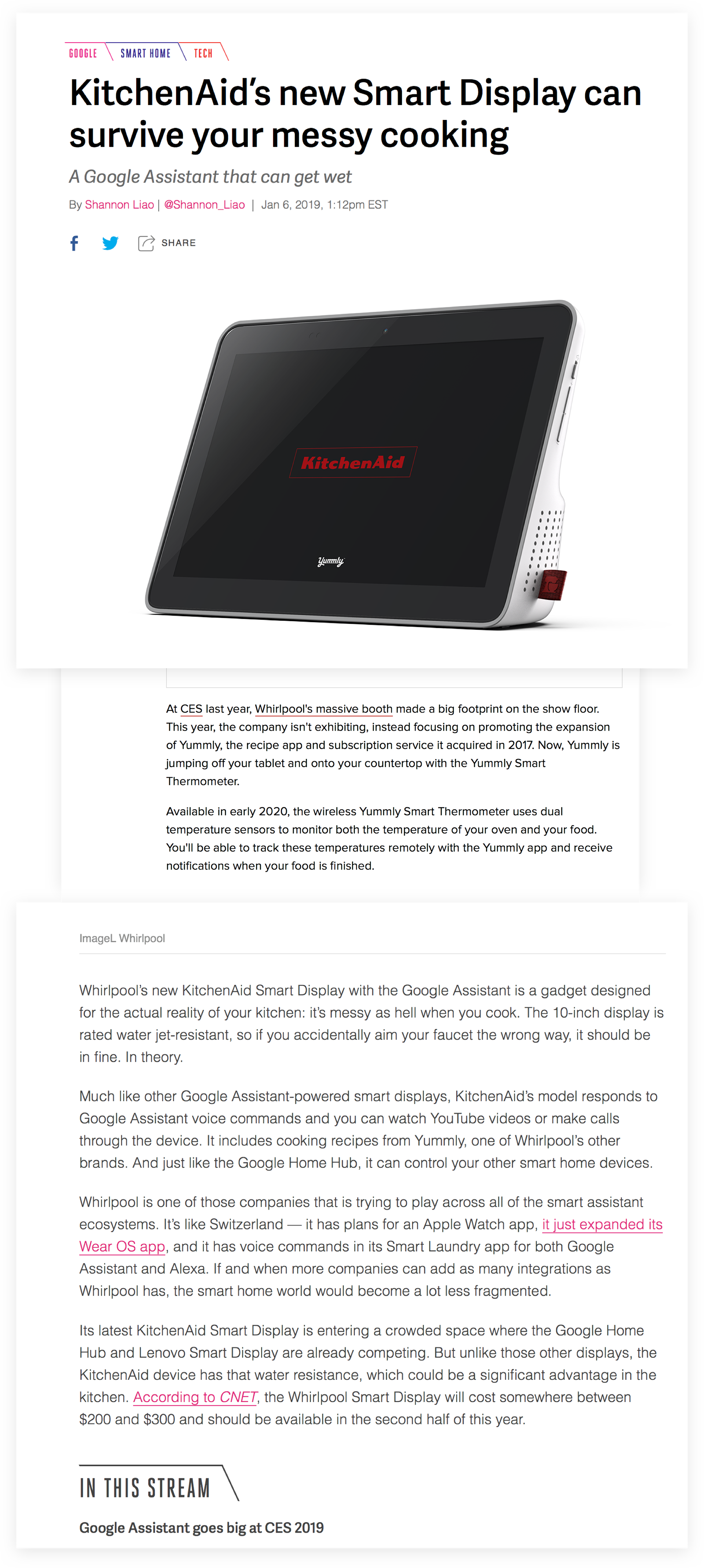
CES 2019: The Beginning
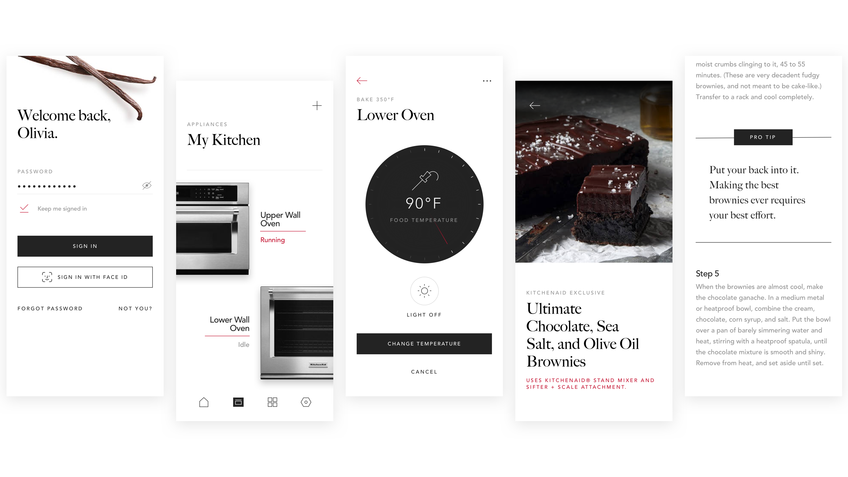
For Whirlpool's CES booth featuring its family of brands' latest tech, ANML was asked to drive the design of Yummly integration for the upcoming KitchenAid Smart Display. In crafting a simple, scannable interface that can be used in a messy kitchen, our audience is able to cook alongside pro chefs in the comfort of their own kitchen and at their own pace — and pause or rewind with only the sound of their voice.

"Wait, how did she flip that again?"

We focused on creating an interface that allowed for written instructions, lists of ingredients, and step-by-step guided video content to live together, making it easier than ever before to cook at home. We were on track from turning a rough concept into a fully paid platform that inspires aspiring chefs to get up and cook.
Most of of the Yummly visioning work I'm a part of is done behind closed doors, and will remain so. What I can say is that, (in line with my own work ethic), at Yummly we work highly iteratively.
The simplicity in the Yummly Pro logo came from earlier work on lower thirds and sizzle reel badge applications I worked on for Chef Alia Dalal.

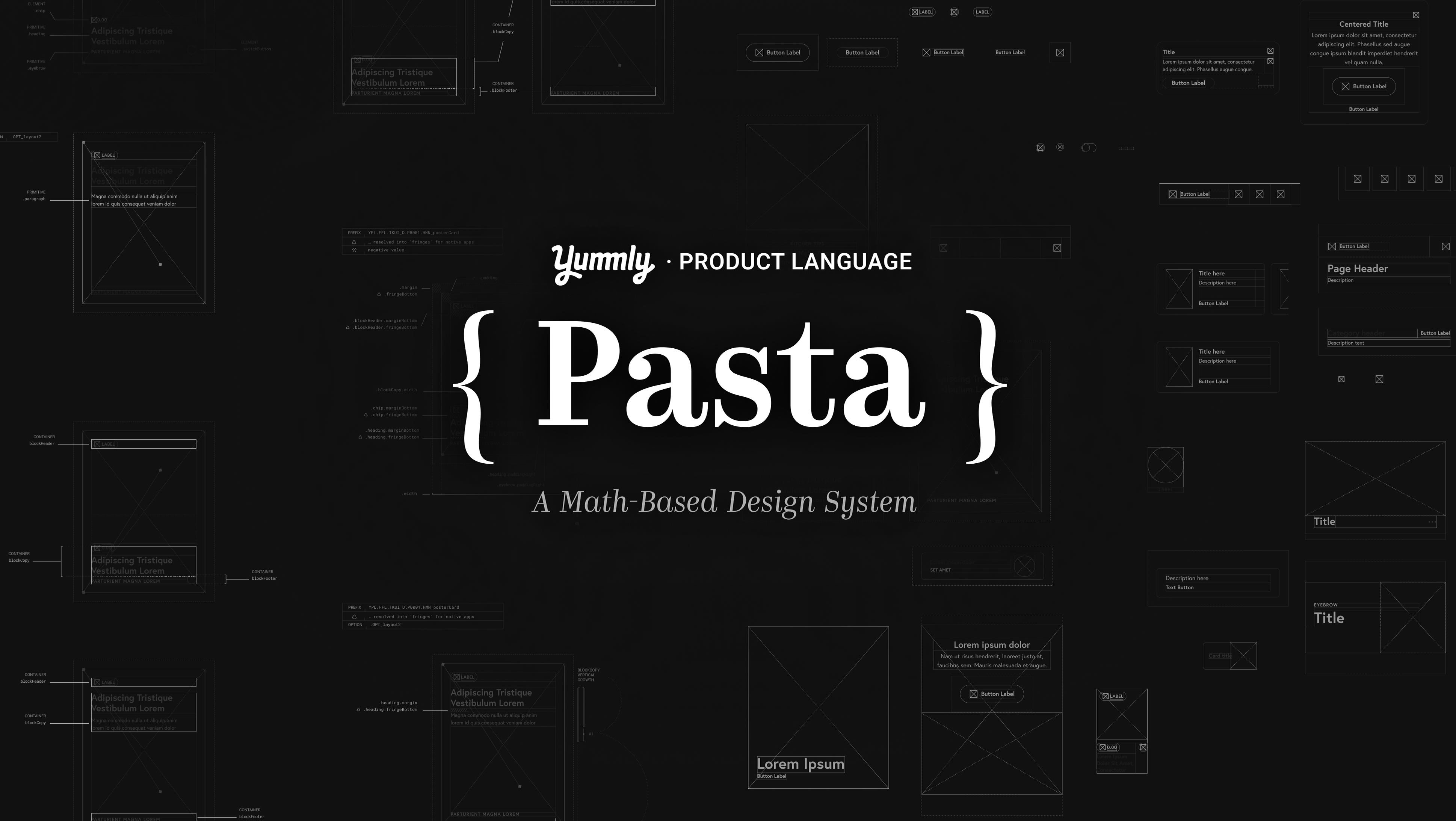
The Yummly Pro logo
As the guided chef experience design progressed for the KitchenAid Smart Display, my Creative Director and I questioned whether content was feeling special enough. We started to wonder how exactly the idea that in this Pro content needed to be showcased in a way. Could this be it's own brand entirely? Whatever it was becoming, Yummly Pro felt like it really needed a mark.
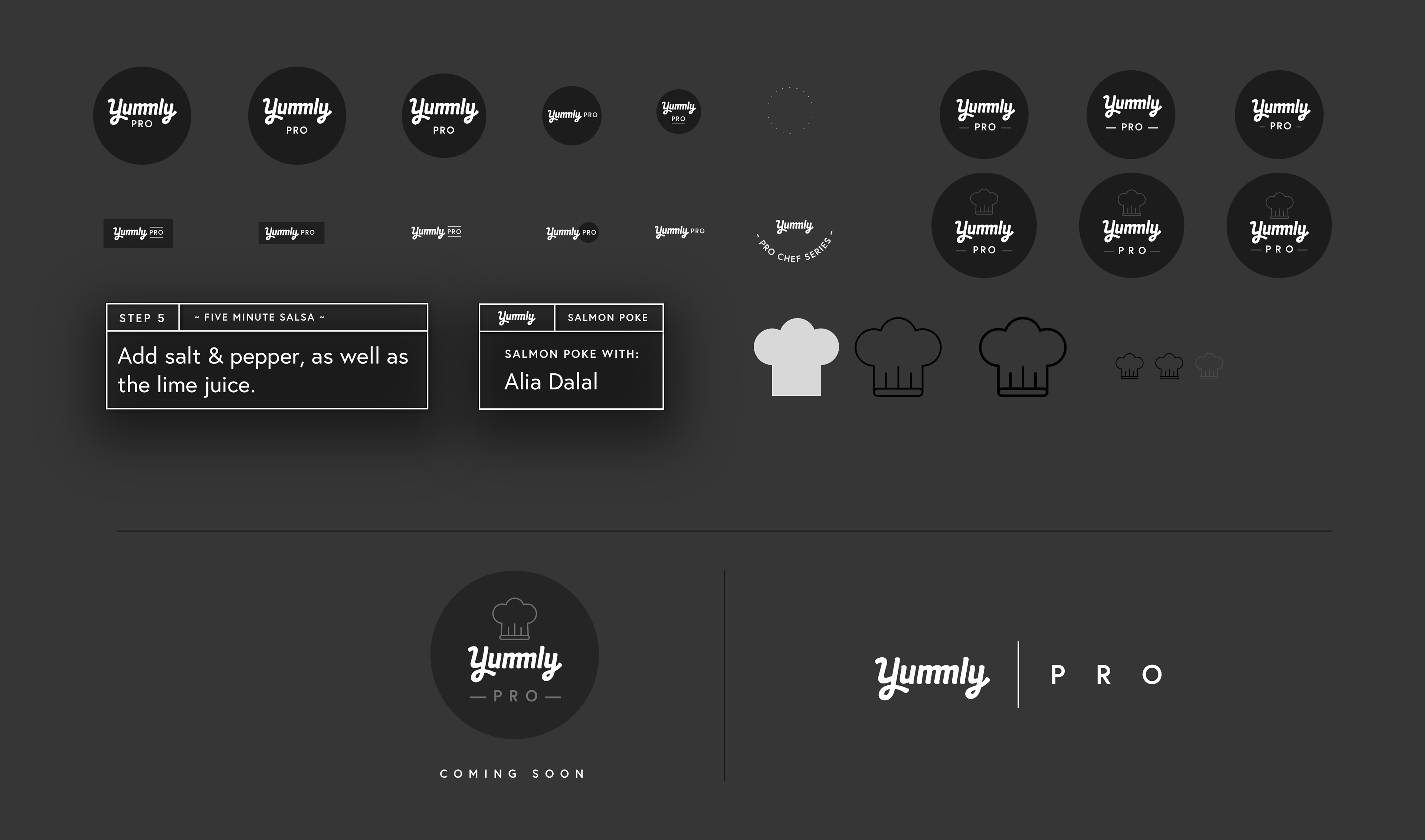
We settled on a more withheld design for the mark.

Project Status:
• Shipped

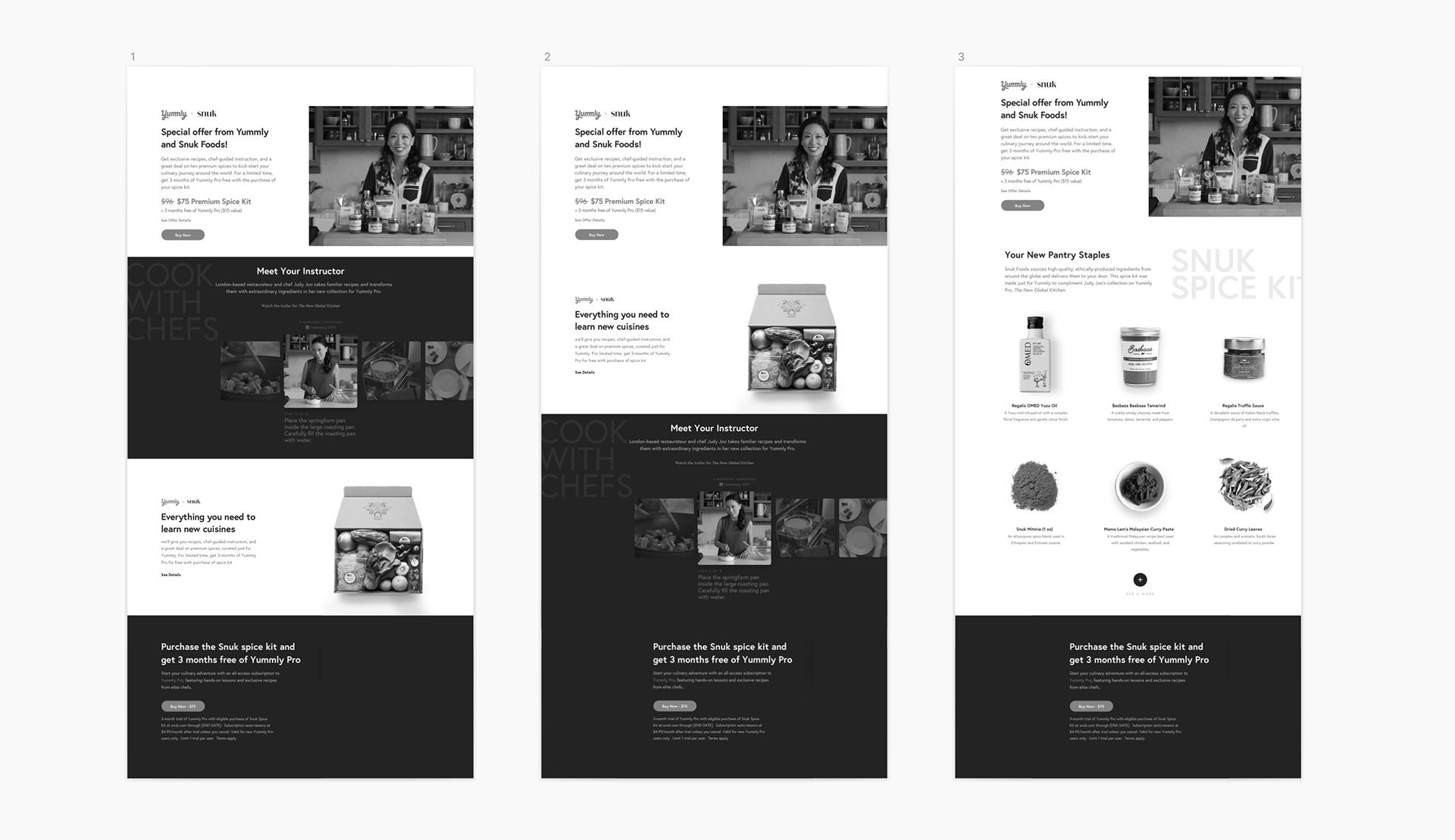
Snuk: One Spicy Gift
In 2019, Yummly announced a partnership with Snuk Foods, a luxury online farmer's market of sorts. The goal was to bring a chef-picked set of exotic ingredients to the user’s doorstep at a much more affordable price, and mix them into a guided cooking experience with Yummly Pro. We brought the talented Pro Chef Judy Joo onboard to curate the collection, and do what she does best.

Get exclusive recipes, chef-guided instruction, and a globally sourced package of premium ingredients to kick-start your culinary journey around the world.

While Pro was still in a beta state, this Snuk partnership responsive landing page design was the first opportunity to build high level components that could continue to the evolve the Pro brand. It was also a great chance to highlight future KPI's to later inform an official landing page for Pro. This landing page went under heavy testing, and you can read more about it in my testing overview below, (feel free to skip).

Testing Overview
Yummly ran 40 tests, with 3 variations of initial wireframes, (done before I joined this project), with an email value proposition CTA directing users to the Yummly + Snuk Spice Kit landing page. Given we would have many site visitors from outside our existing pool of users, we gave a lot of thought to the exact flow of information in the order we presented it.
Test Audience Demographic
• Age: 25 - 40
• Salary: $60k - $150k
Variations on the order of content, 20 / 40 tests leading with a summary of the offer. Some of the variables:
• Placement of offer summary
• Showing an image of Judy with and without the spice kit ingredients.
• Amount of Yummly Pro information, and Pro recipe detail views.
• Approach to listing spices.
• CTA text and overall messaging
A Critical Conclusion
One crucial decision we made from looking into the test results was that more than anything, we needed to make it clear to users what they were buying. We chose to lead with a very clear summary of the offer.
“Meet your instructor”
Over 50% of users liked the idea of seeing Judy in context of the cooking experience. Some users specifically pointed out that they liked seeing the chef with the ingredients. We realized we might be able to really sell the idea of a holistic package with Yummly Pro.
Pricing
With the initial pricing description, were were asked to provide some notion of what the offer is worth. However, Users Reacted generally negative to the idea of a discount in the form of a percentage, which was completely surprising to me. Some elaborated similarly that it cheapened what they thought was a high quality offer — wow. That’s why you test.
You’ll notice that with a white pricing with the main CTA to buy stuck to the bottom of the page as they scroll, there are not a lot of other CTA’s. Aside from the “view collection” text link, we wanted to minimize the problem in early tests with some users getting distracted from their task of learning what the offer is, by links off to other pages. Recipes and descriptions would now only actionable in the sense that you could view several of them on this page.
We’d also need to especially consider those predisposed to like / dislike certain aspects of “exotic foods” — imagery, language, and price positioning can all influence a buyer’s perspective.
Hit em with the tater tots.
For those that still weren’t sure “what the spices are,” we wanted to make it a goal to really curate the 6 recipes we were showing in the carousel. We started with something recognizable like tater tots, communicating the benefit to the average user to take a fresh spice to everyone’s favorite take on potatoes.
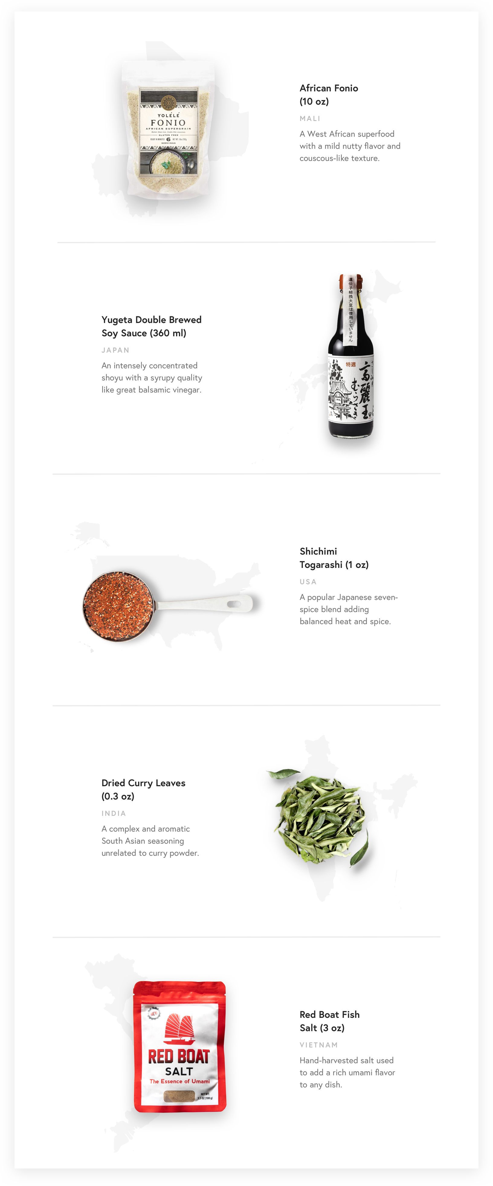
Where in the world?
We were asked finally if there was a way we can integrate some sort of contextual queue to better communicate the specifics of these spices?
I solved the problem by reconsulting with the broader Yummly team to find out exactly where these spices were coming from, and took it a step further to indicate where in the world visually and literally. I developed an organic custom grid to lay the best selling spices on each breakpoint with its country of origin illustration, and some notation explaining what exactly you’ll receive from this spice as it comes in the kit.

The Pot Thickens
Judy Joo is a fantastic chef that brings so much knowledge to the table in her guided recipe experiences. Along with this, we knew the Yummly Pro content is rich and vibrant, but also elegant and filmed with a high degree of quality. It was bold. Our intuition told us that to continue to be bold, we needed to improve to look bold. Think of a complete visual reversal of the Yummly platform as it stands.
We tested a familiarly light version and an alluring, cinematically dark treatment to showcase Judy & the spice kit. If you had to guess which one caused dozens of users to respond unprompted with the word "premium?"...
(•_•) ( •_•)>⌐■-■ (⌐■_■)

Dark Mode: Activated
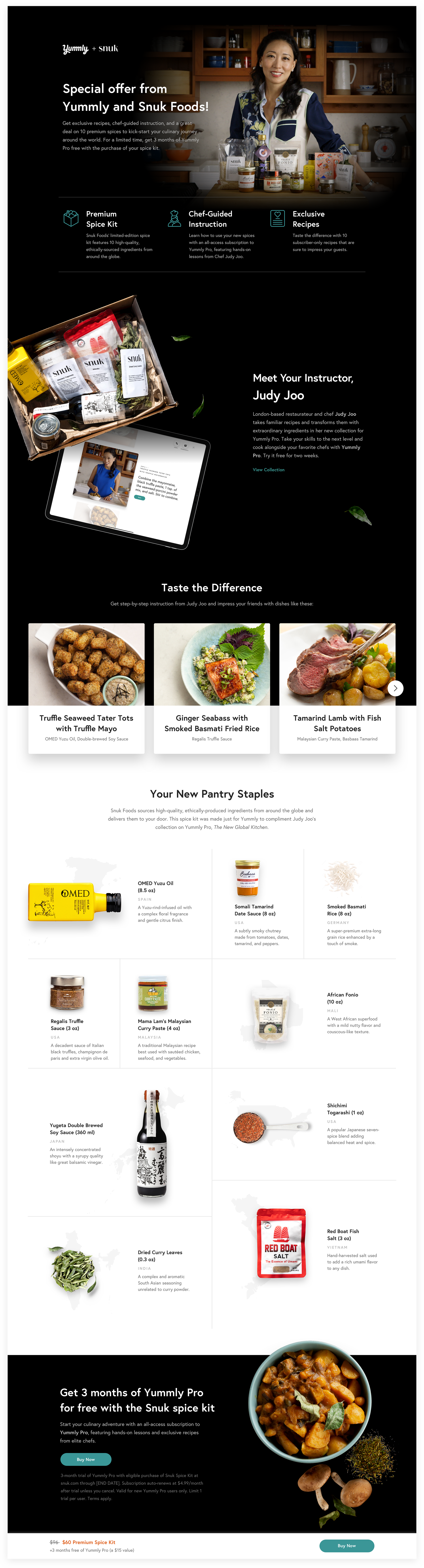

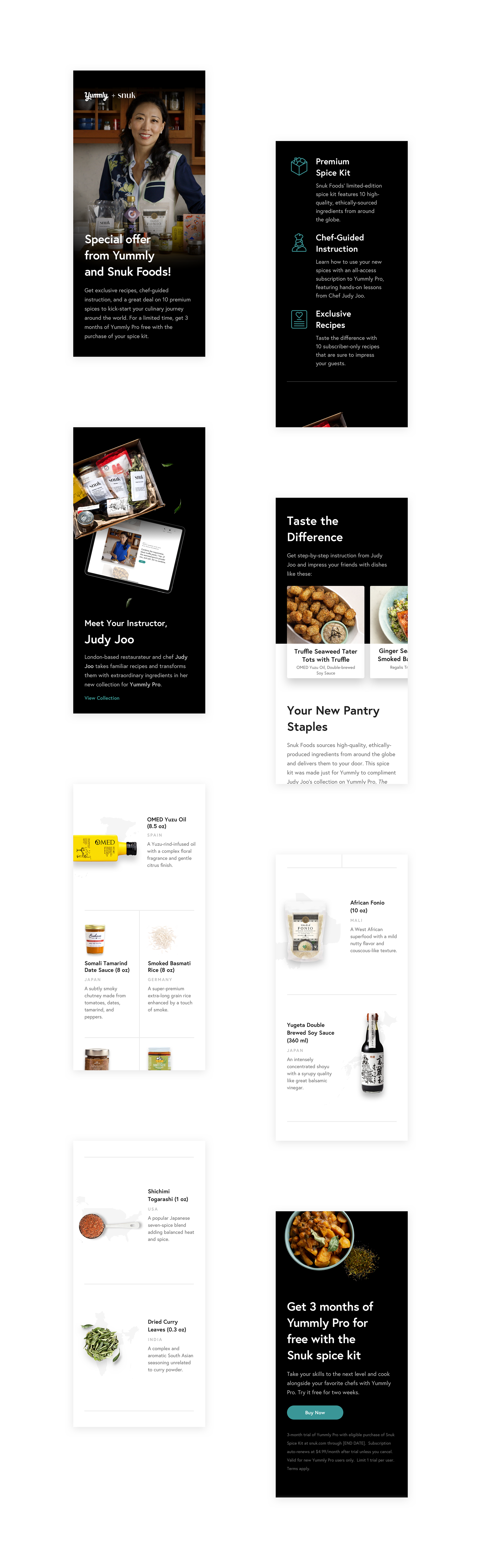

This idea of these striking contrasts changed so much about Yummly Pro. When it comes to knowing about and cooking with top tier spices or exotic, pricey ingredients, it's sort of: if you know; you know. But for those not in the know, showcasing a little story to bring these ingredients to life was a keen response to user concerns: just exactly why these were so special. Below is a tablet page design view that shows how I chose to bring those stories to life a bit.

Project Status:
• Shipped

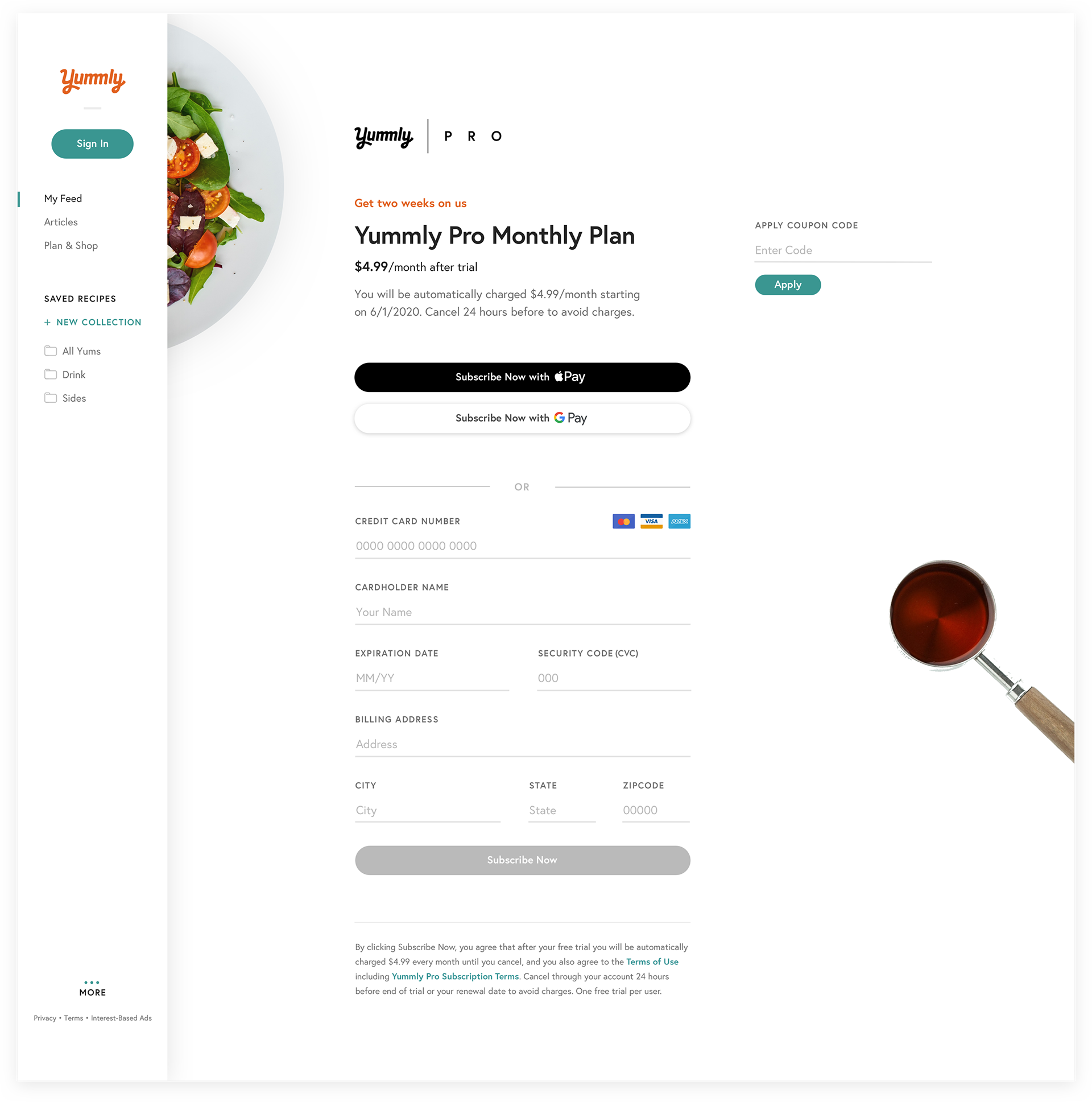
Yummly Pro: Entry Points
I was asked to apply my design approach built from Snuk to inform a modal design serving as a primary entry point to Yummly Pro education. If a Pro recipe card draws a user's attention on the home feed for example, they'll prompt a modal to inform and sell them on the platform. The goal here was to grow our base of Yummly Pro subscribers.
The Yummly iOS app is our leading platform in terms of users and conversion rates; it's simply much higher performing. The desktop web experience, however, has always been one of our leading platforms, so we began our testing there. Below, the current modal experience.
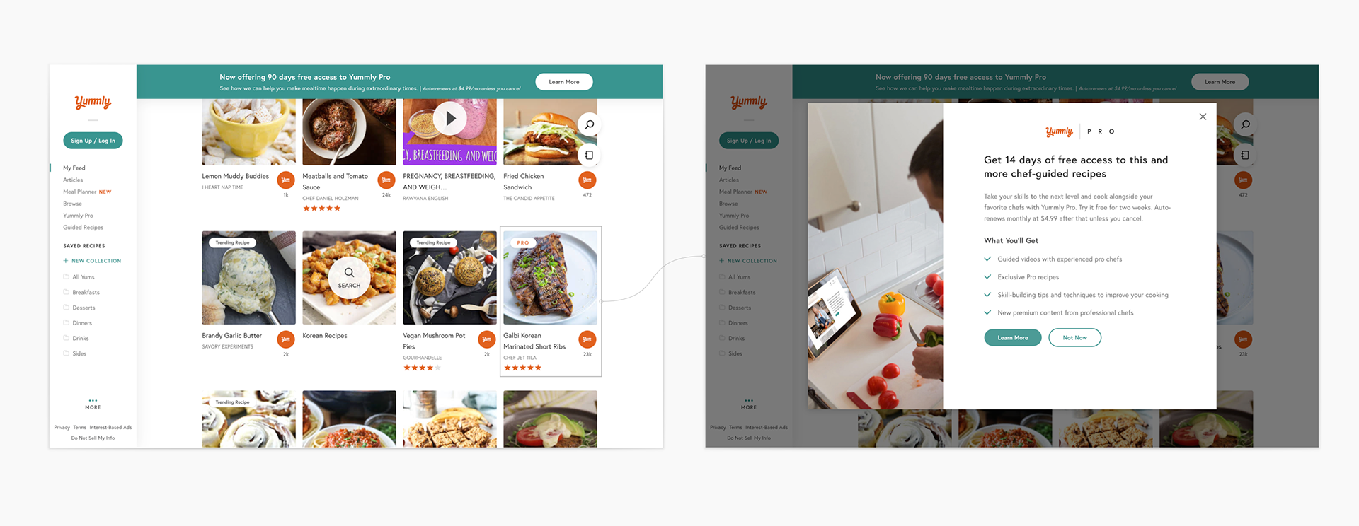

I was asked to bring these entry points to life with the new Pro style. While messaging will always be evolving, the ask was to keep the existing language, and instead focus on the visual output. I designed a double set of directions that brought focus to design approaches like a dish close up, a recognizable celebrity chef, or a set of simple value propositions following the rule of thirds. Below are some of the finalized variations for the first round of testing.
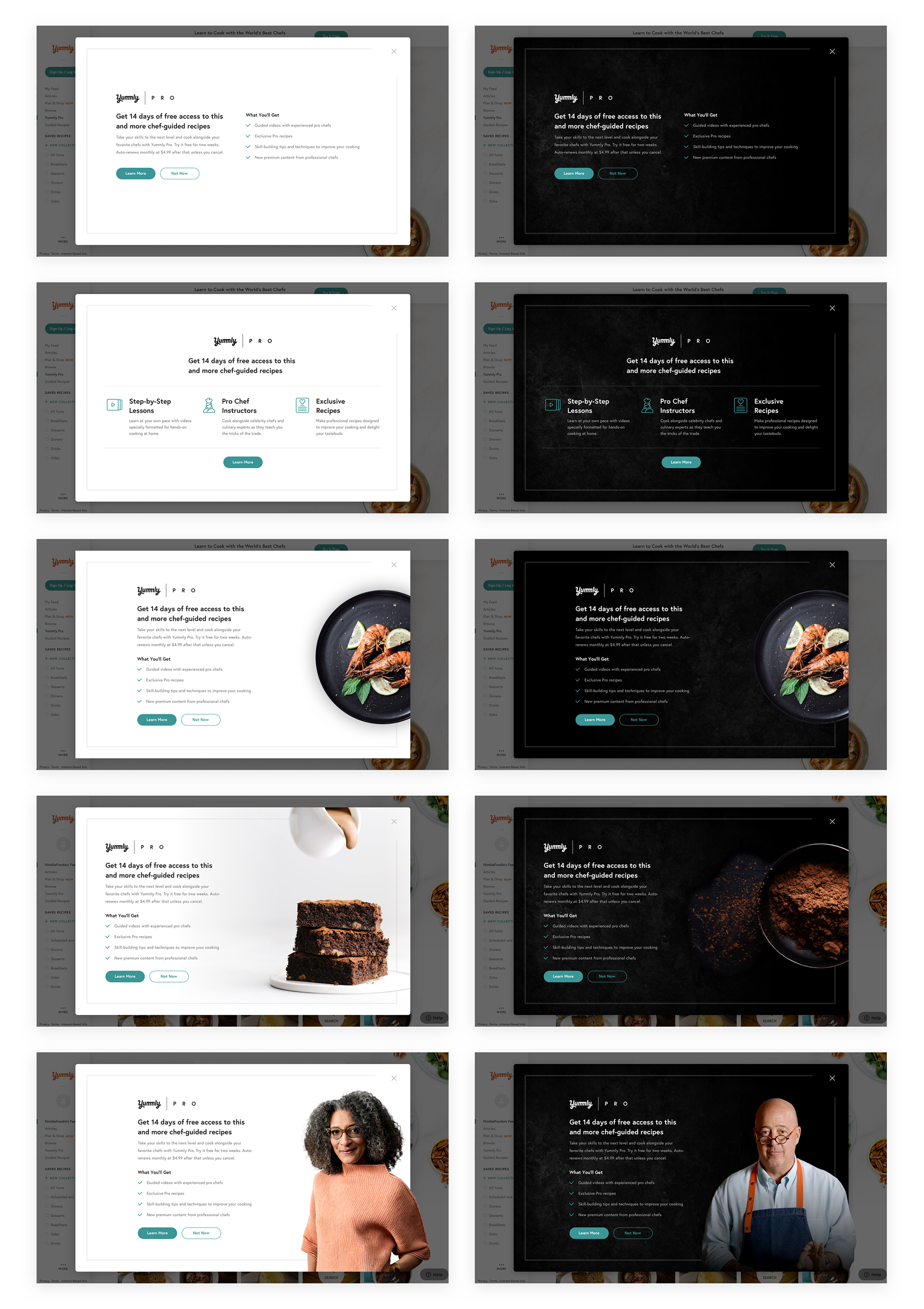

The last version with our best performing chefs was the unanimous favorite — until...
We tested, and well…it turns out users in the study didn't recognize the chefs well. That’s alright, because to be honest neither did I at first. Some might see this as a wasted effort. For me that's not wasted time, rather a lesson learned. So we move on to acknowledge our responsibility. As said before, if we know the chefs are an important part of the pro user journey, then it's our job to teach users who these chefs are, and why they should care.

Below, some alternate design explorations for full / non-full screen modals on the iOS app mobile breakpoint to present the sell.
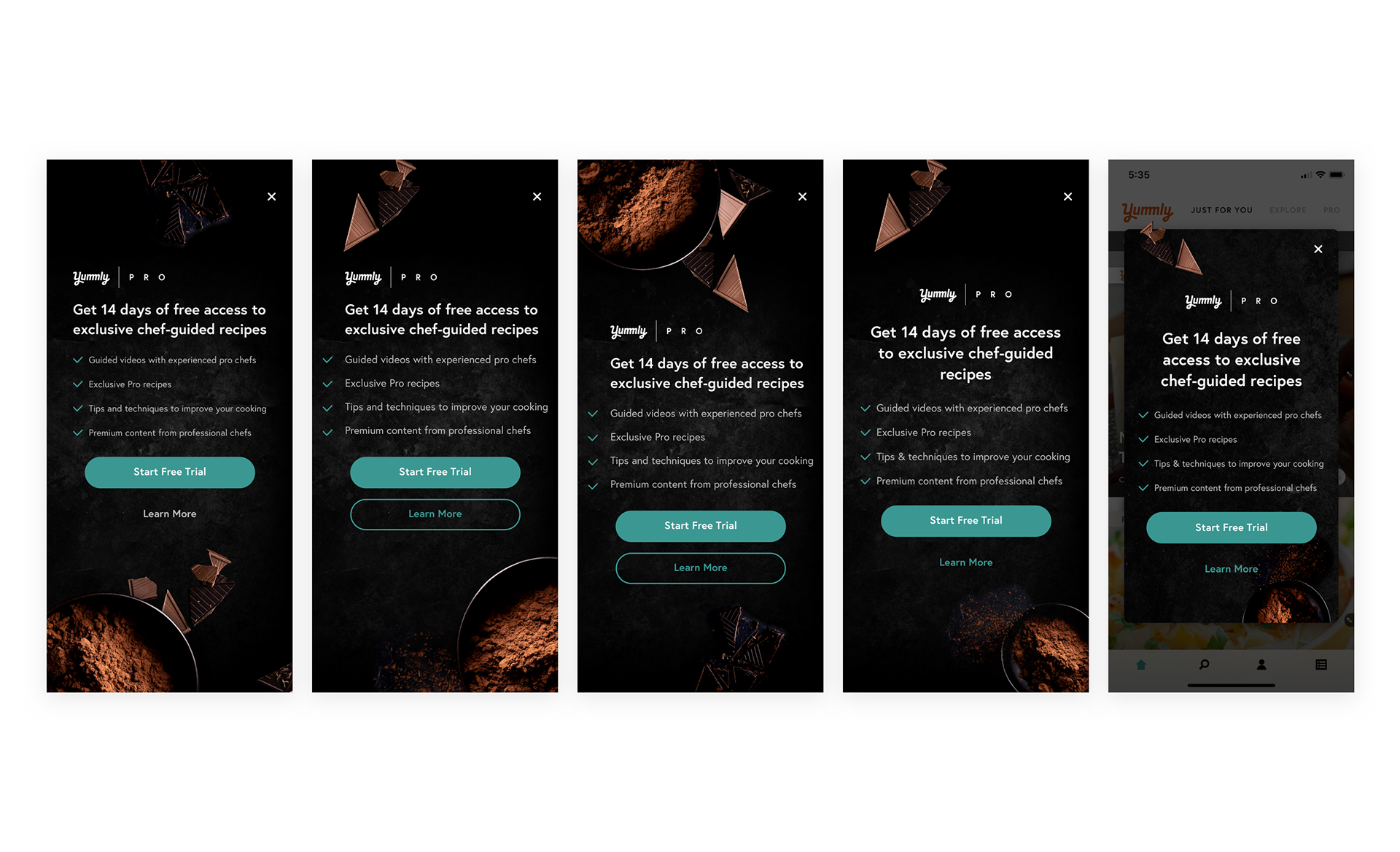

Below are the some of the key breakpoints and contexts for these modal designs. The tablet design is measured to eliminate the need to scale on rotation. These two directions would constitute the second group of tests to run their performance.
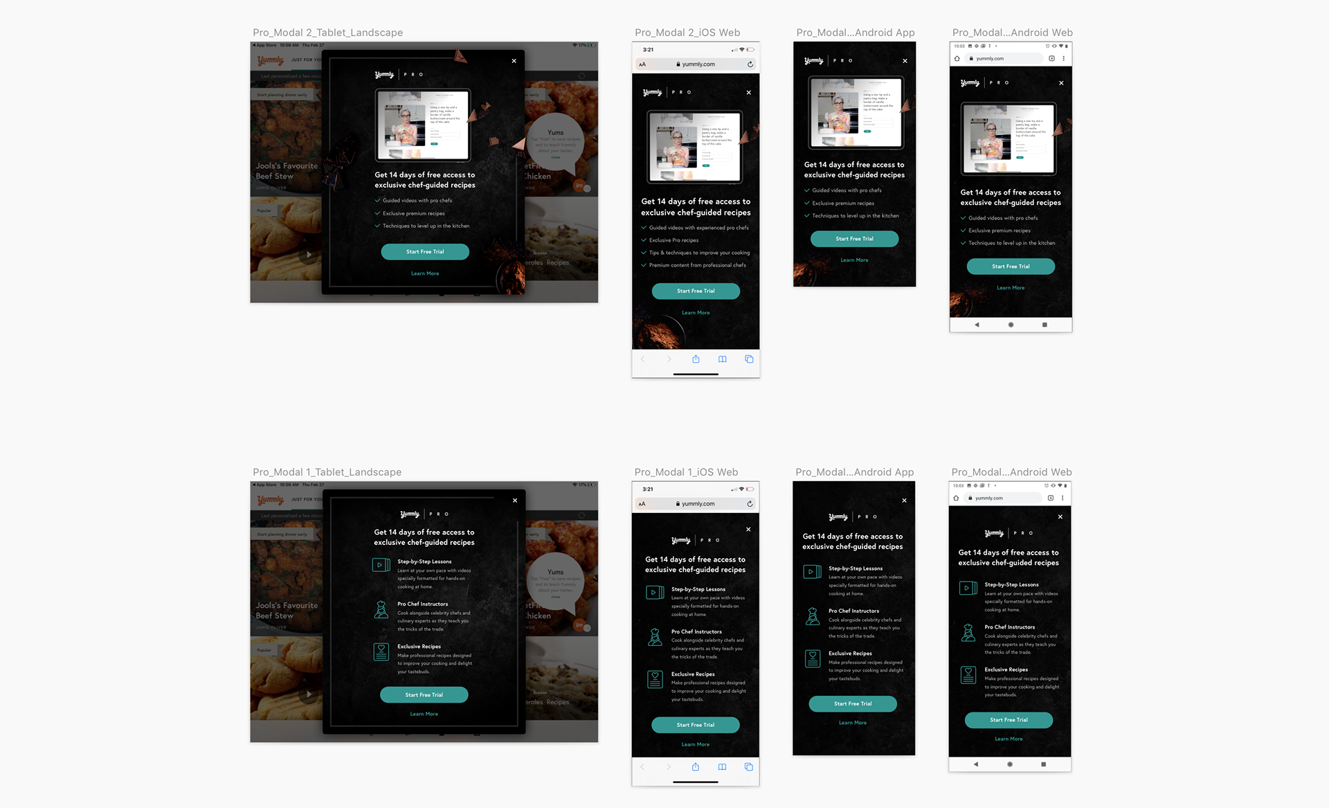

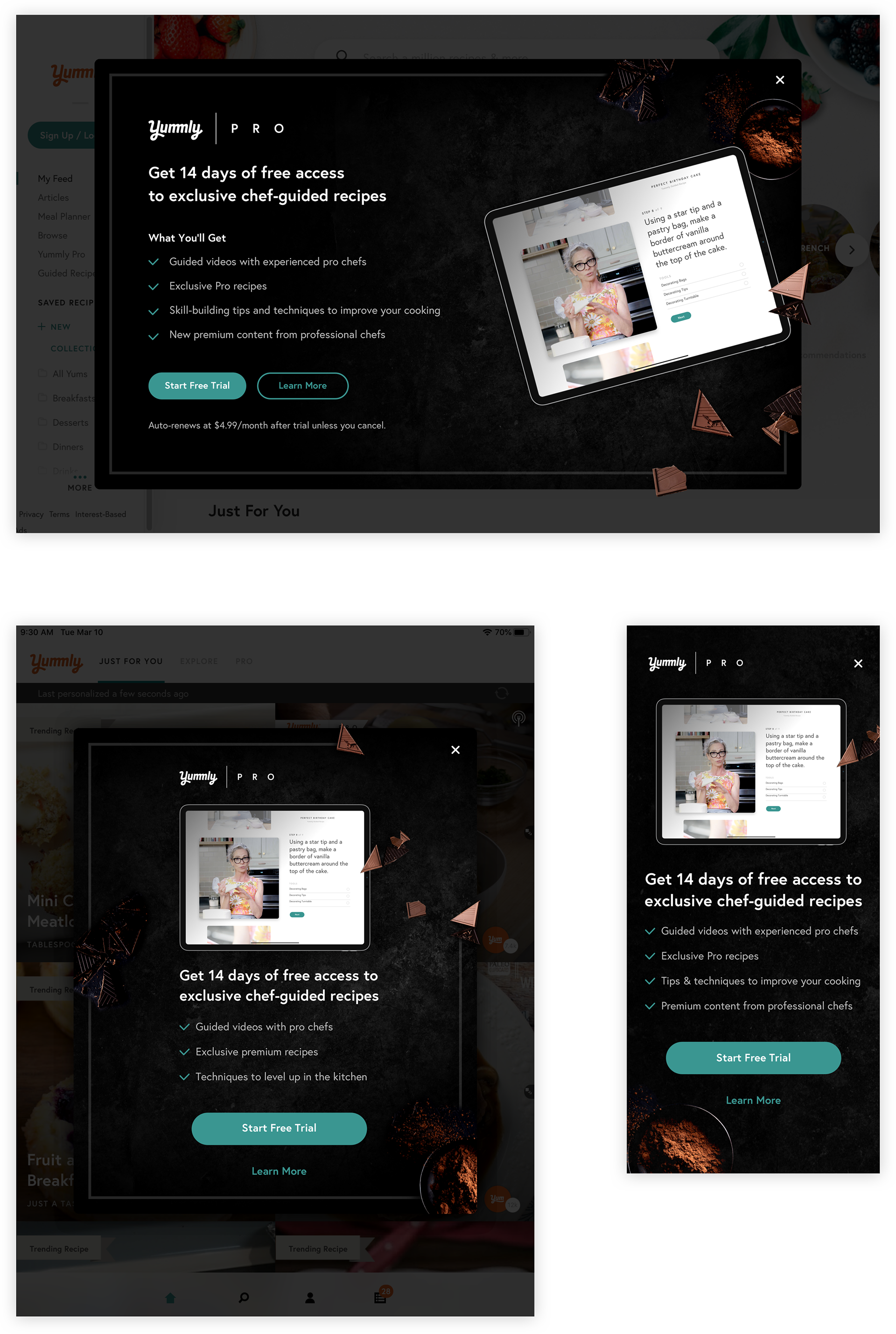
Final Design:
Yummly Pro Sign Up
I designed every entry point of the Yummly Pro platform to have the the same impact across different devices, also allowing for some flexibility with copy to make things easier on the writing team.

Calling the right shots:
How did we know in the end that food would perform better or worse?...
When we spent that time testing, we worked on eliminating variables by looking back to what has made Yummly successful so far. Hint: they’re the best photographic performers on the site, and the reason people click on recipes — the food pics.
Since the release of the new "Sign Up" modals, the conversion rate spanning the last two weeks for Yummly Pro subscriptions went up by 7x! Week over week, we have noticed a clear 2 step function in effectiveness in converting / retaining to paid users with the past introduction of the "90 Days" free trial since Snuk as well. Given the surge in Yummly traffic over 2019 - 2020, our goal now is to keep the awesome content flowing and look for opportunities for incentives for users as subscriptions continue to steadily grow.
Visual design matters. Always.
There's a moment for every person passing by your app in the App Store, or scrolling past your post on Instagram. You have at most a two seconds window: that's your shot to make your first impression. You know what you have to offer is valuable - so how are you gonna show them something so endearing & beautiful they have to be intrigued to learn more?
I’ve realized that in all the years of the design industry’s drastic leaps, one thing has never changed: you need catch people's attention. Once they've granted you that, you better reward them with an amazing experience. That's the least you can do — especially when you’re asking them to do something.

Project Status:
• Shipped

Introducing Featured Recipes
For Pro users who have successfully signed up and go on to view their favorite chefs collection, we need to keep in mind they will have different individual goals for their learning, and motives for signing up in the first place. In the example below, we're looking at a user interesting in healthy eating.
For a while now in areas like our Articles page, we've toyed with the idea of a featured recipe - the one that just catches your eye. The kind where we get to quote some user's responses to getting completely captivated, like:

"Hey, I recognize him from the tele!"
and
"Ooh that looks f*cking lovely, I'm gonna click that."

YES.
It takes time for me to collage out all the photography we cut apart, and when we drop those kinds of labor into the platform in general, it's pretty cool to see the delight in people's comments. It's really true in a way that the food simply just sells. This motivated us to seriously consider one featured recipe in every Pro Collection in hopes that we might bring some inspiration to the page’s visitors, and carry that into the checkout process. Below, some in-progress web design updates being tested.

The masthead plays the collection's trailer film and introduces the chef to the viewer.

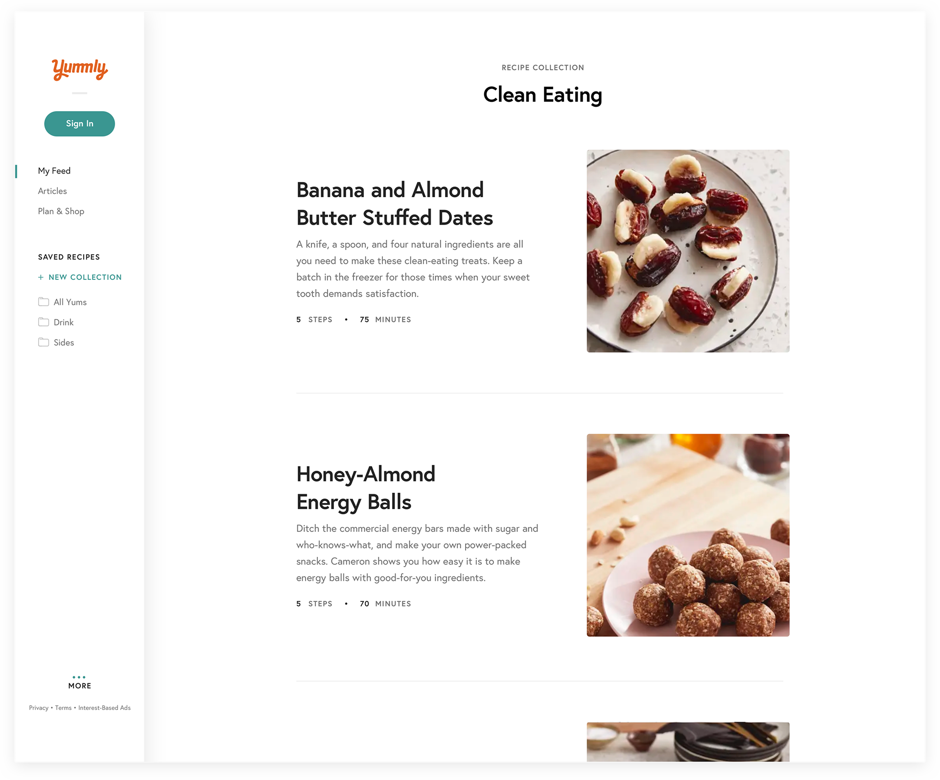
Simplicity is key from this point on, as this page greets both new users, and users returning perhaps dozens of times to from their Yums or saved collections. The viewport below shows what the list view looks like beneath the fold.

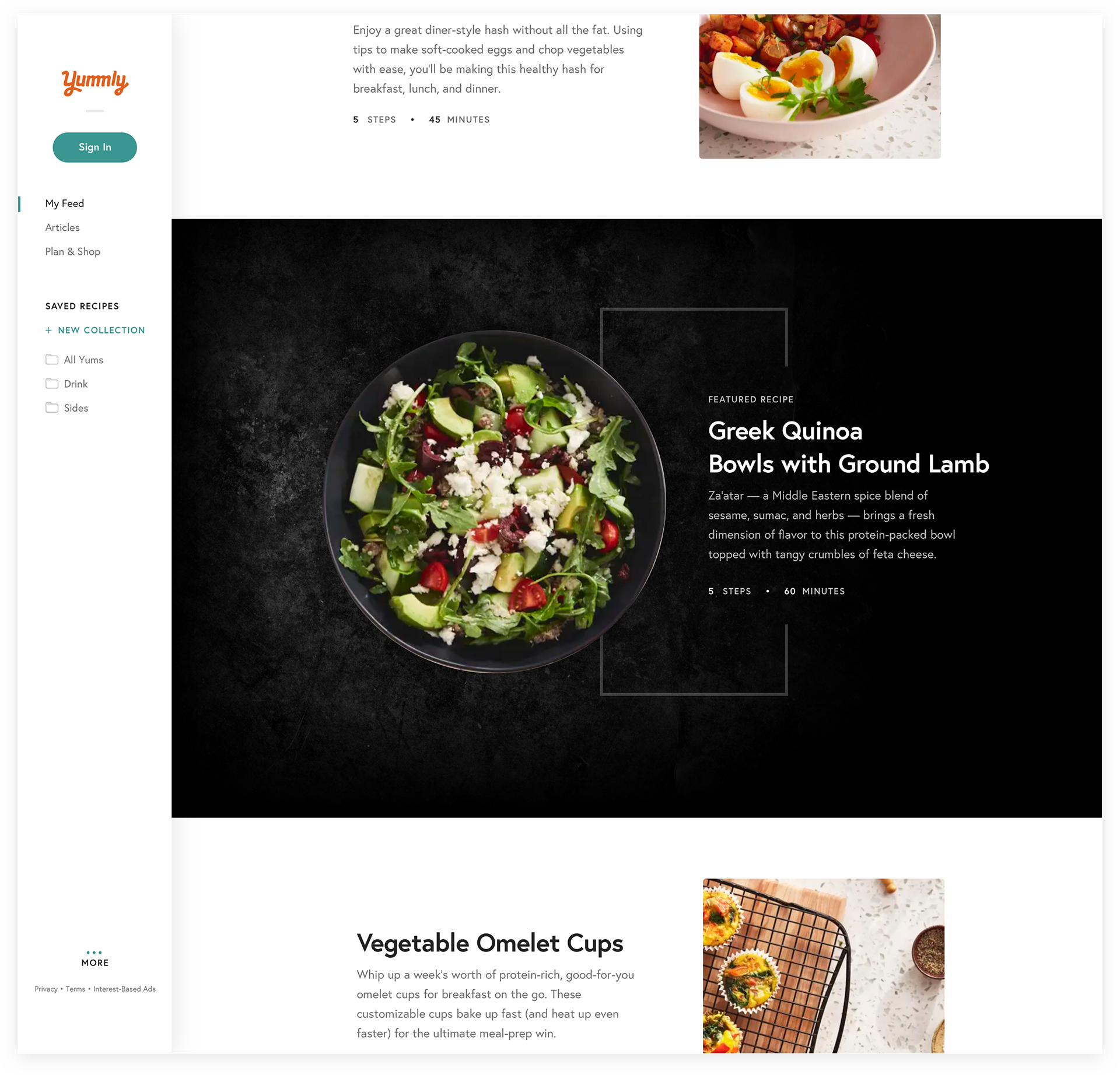
Version A
A highly treated "Featured Recipe," a concept to generate more interest in the collection as a whole. This treatment can be valuable for continuing to carry across the heroic imagery on slate textures to drive intrigue for new, or less active Pro users.

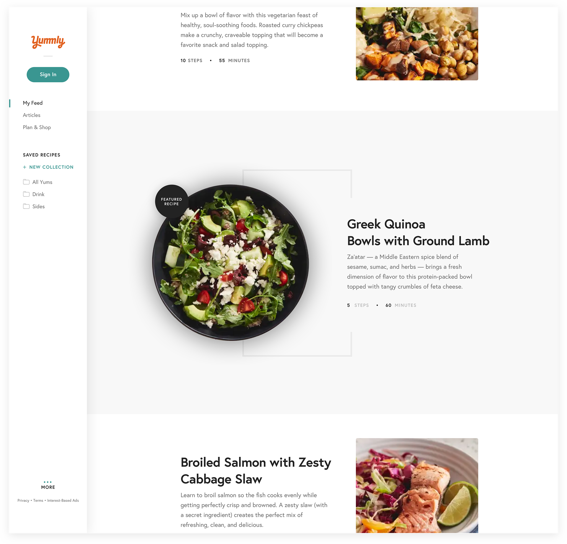
Version B
Here, a more subdued treatment on the opposite end of the contrast spectrum. One key difference here is introducing the concept of a tag that accompanies the hero image. We've gotten reactions from users about the background treatments eliciting entirely different feelings for the same recipe, and its potency for nutritional value. There's no concrete evidence to support a conclusion either way, but definitely an interesting thought as we continue to think through these in our upcoming deeper user flow exploration.

We're currently experimenting with how a more withheld design revision of how the Pro style can be applied. Given that the screen below a checkout page, we want to hold off on eliciting major reactions here, and keep the buyer focused on the task — especially if they've chosen to enter their card manually, prolonging the risk of distraction.

Project Status:
• Testing Phase

Branded Explication
An example of Yummly extending its reach into co-branded integration in other contexts. Below, Yummly Pro in a physical canvas banner design for a KitchenAid branded showcase.
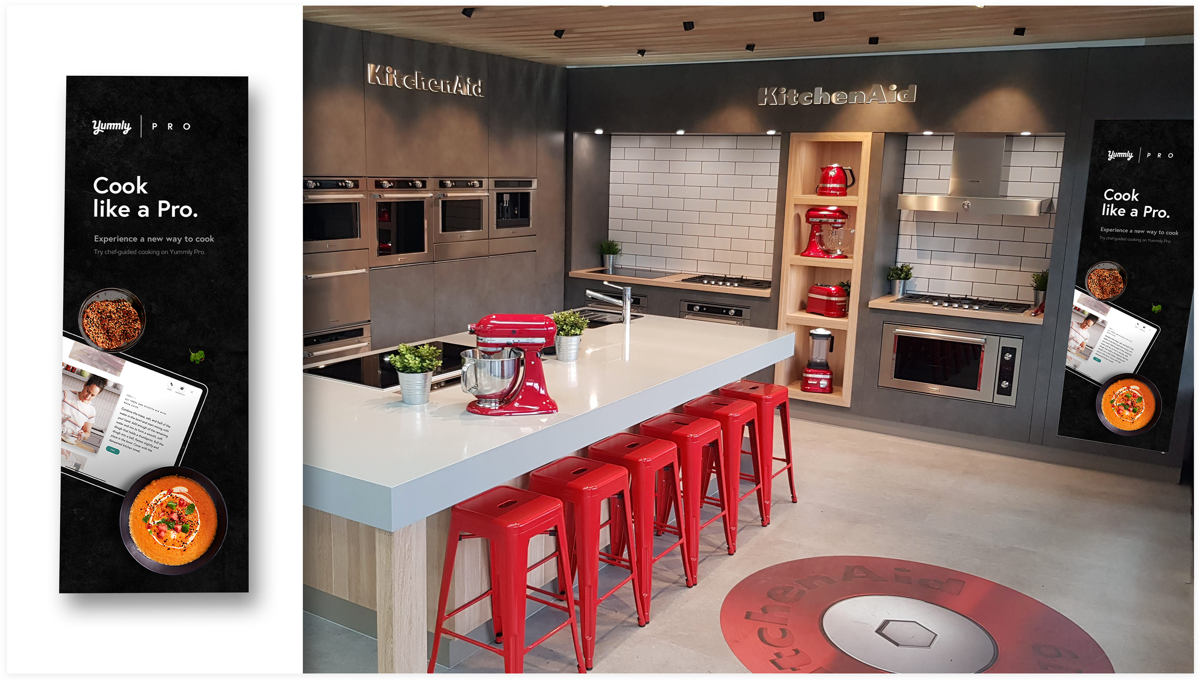

Project Status:
• Shipped

Outcome

Pro chefs Gregory Gourdet, Stephanie Izard, and Ali Rosen.
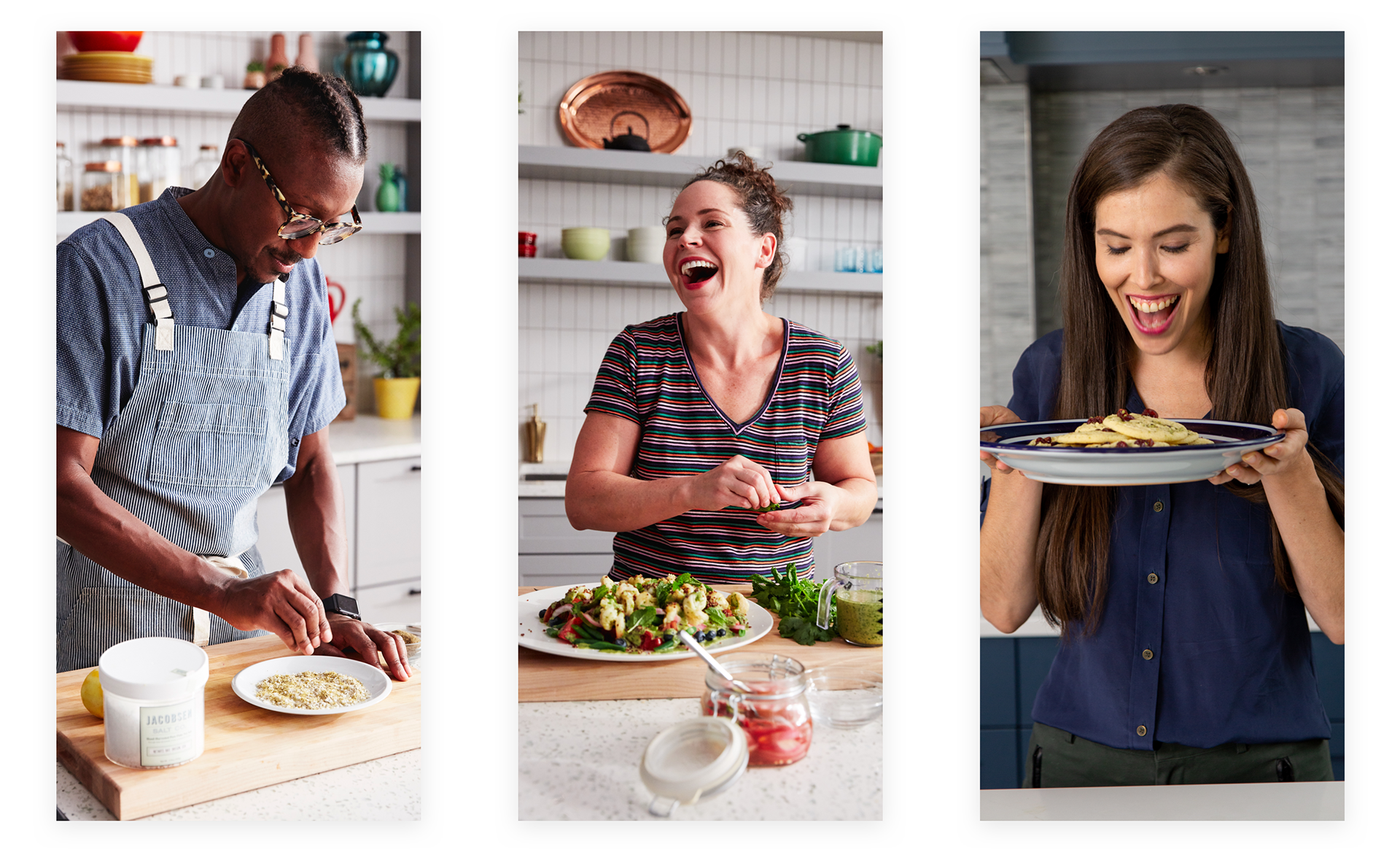

Our chefs drive the experiences with their individual personalities, and the value they bring to the kitchen with their incredible recipes. The Potash Twins recently shared their debut recipe collection one night, hitting 10,000 views in a matter of hours, with comments from a long list of celebrities. That kind of stuff is the reason we put in the work we do. Over the last year or so, we’ve gained critical user insights from each design we ship. We’ve never forgotten that every single Pro user at this moment has subscribed for different reasons — their own reasons. From Alex Day's masterfully crafted cocktails to Carla Hall's rich personality in the kitchen, the personalization goals we talk about all the time for the entire Yummly user journey is paramount. It goes beyond dietary restrictions, because from hating mustard to seeking untried Asian dishes to explore, each user builds their own unique feed over time.
Yummly Pro may be relatively new to the game, but the service continues to be a focal point in driving revenue for the company. Like everyone, we're facing the challenges of this year's unusual circumstances head on. Our focus is on what we can control: the value of Yummly for the user. Delivery of ingredients, planning meals, staying inspired at home - all of that passion still matters, despite where we're working from. Design never sleeps.

Project Status:
• Shipped