
The Ask
Responsive Website
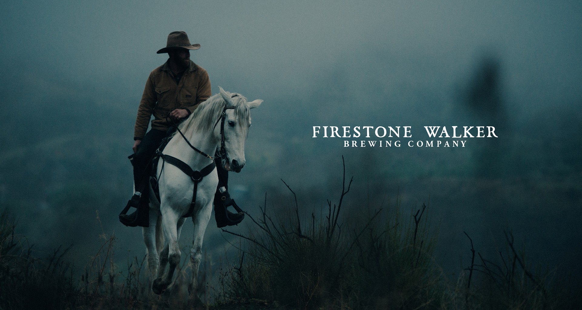
Client • Firestone Walker Brewing Company
Founded in 1996 by brothers-in-law Adam Firestone and David Walker, Firestone Walker Brewing Company is a pioneering regional craft brewery located on the coast of California. They reached out to ANML recently in need of full website redesign, willing to step away almost entirely from their currently very confusing online experience. To top it off, they needed it fast.

My Role
I joined this project more than halfway through the process, tasked to design the foundation for a responsive CMS platform for Firestone Walker’s content creators to easily manage. This meant wireframing and designing responsive supporting pages and interactive components, working closely with the development team.
I’ll reference the responsive online prototype often in this case study — please, I encourage you to interact with the relative pages as you read.

Wireframing
I think a lot about emotion when I design. One thing you'll learn about me is I consider the edge cases, because I am an edge case. I think about the way photography makes someone feel, how much they like reading, and how long they've been on the internet that day. Are they scrolling one-handed on the train, tired after a long day at work? I like to sort out these kinds of things while you can move quickly in wireframes.

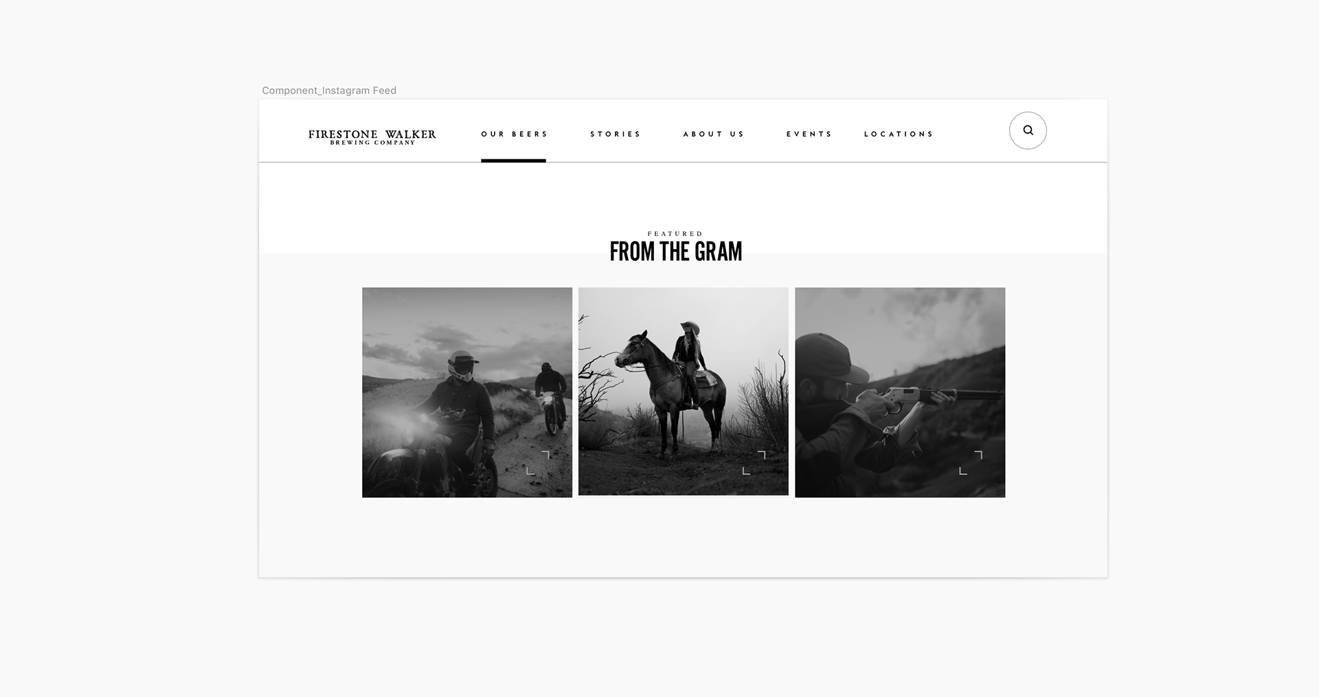
We wanted to highlight the brand's great content from the Instagram feed near the end of the home page.
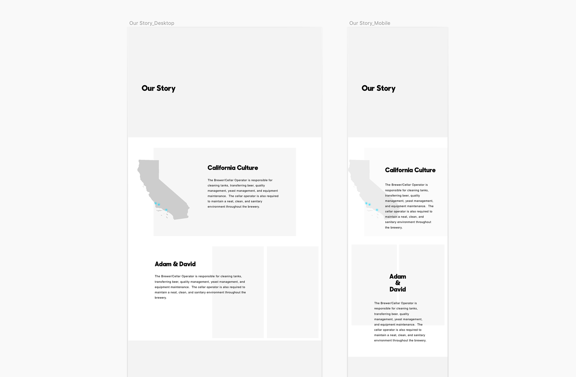
Concepting a new page for the Firestone Walker story.
With a long list of beers in its arsenal, we started thinking of bringing lots of interaction to the Our Beers page.
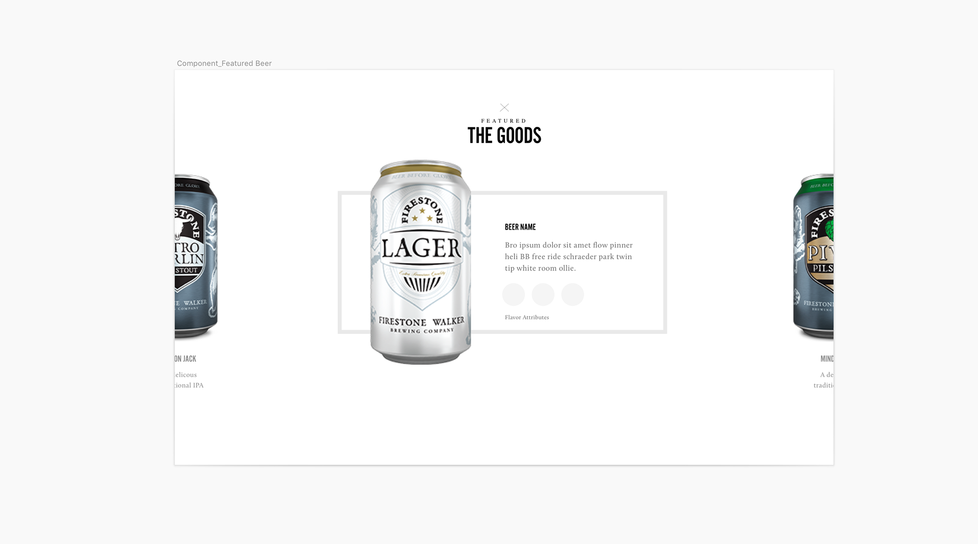
Featured beer component directly follows the home page hero.
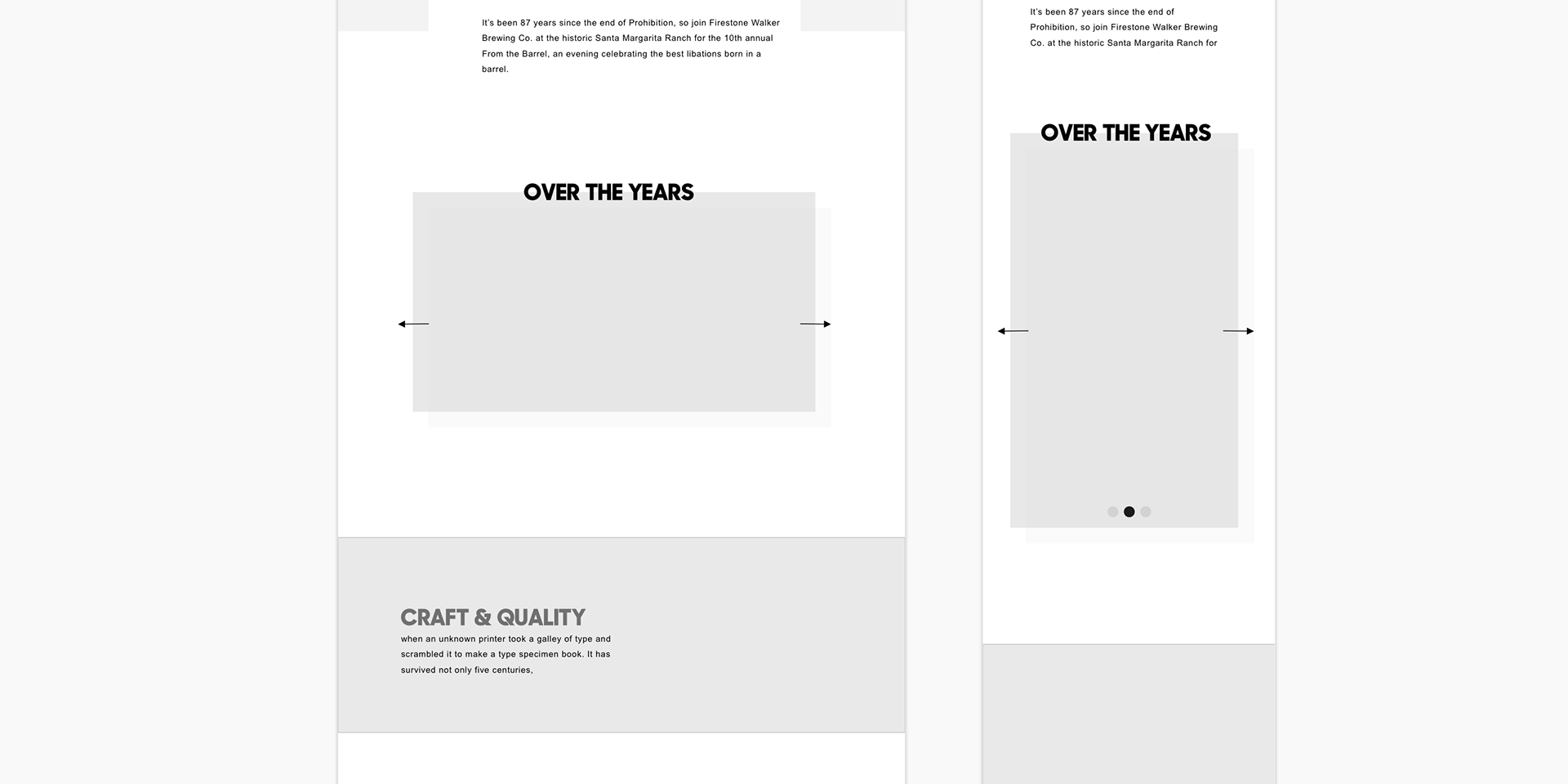
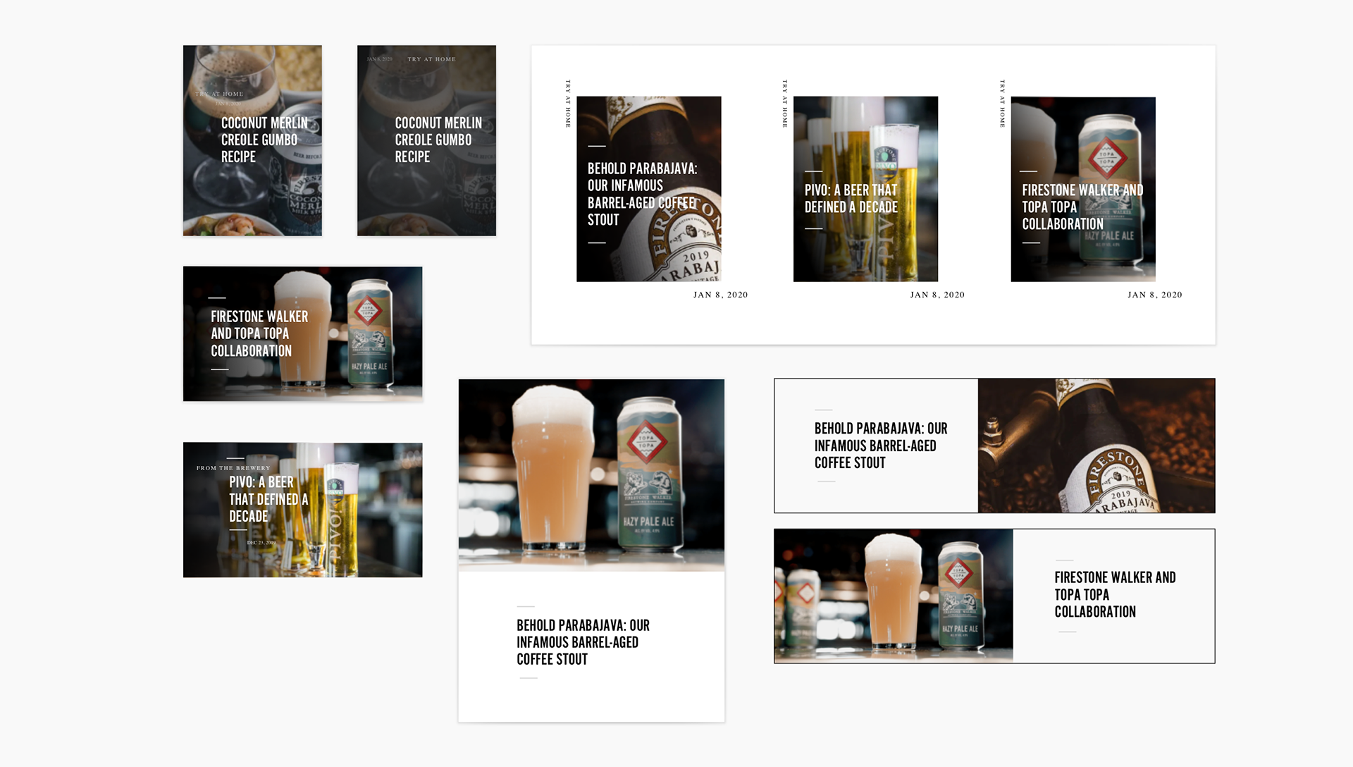
Exploration with potentially needed blog components.

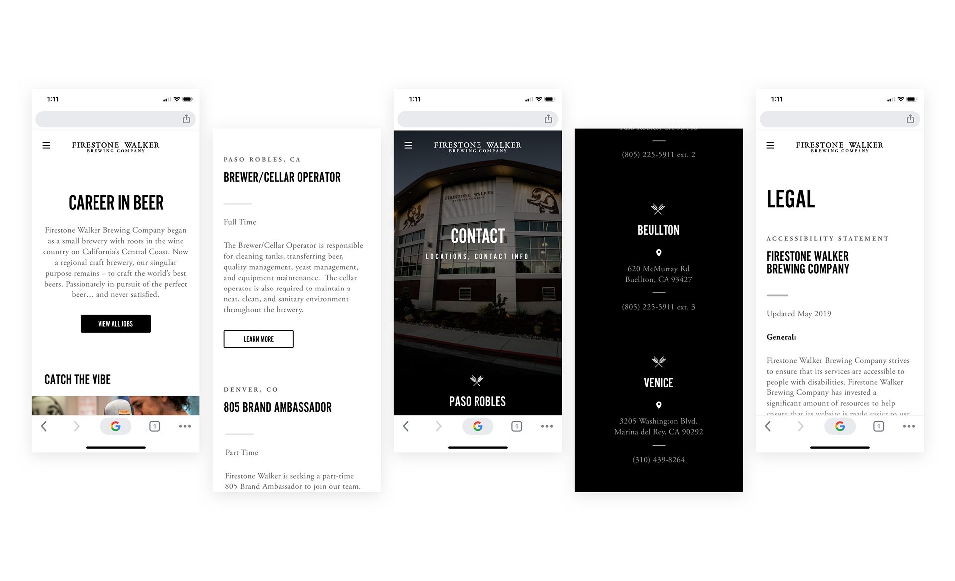
Visiting Breweries
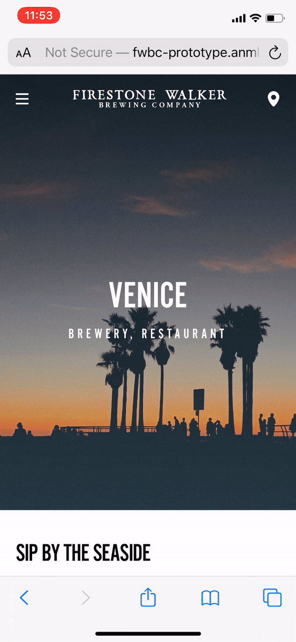
FYI: Californians love breweries. Firestone Walker's locations in particular are pretty popular, (and the food’s pretty bomb from what I hear). The Locations detail page designs were key to setting components such as the photo galleries for handoff to our developer. Because each location has different content, creating simple, adjustable components here was the priority.


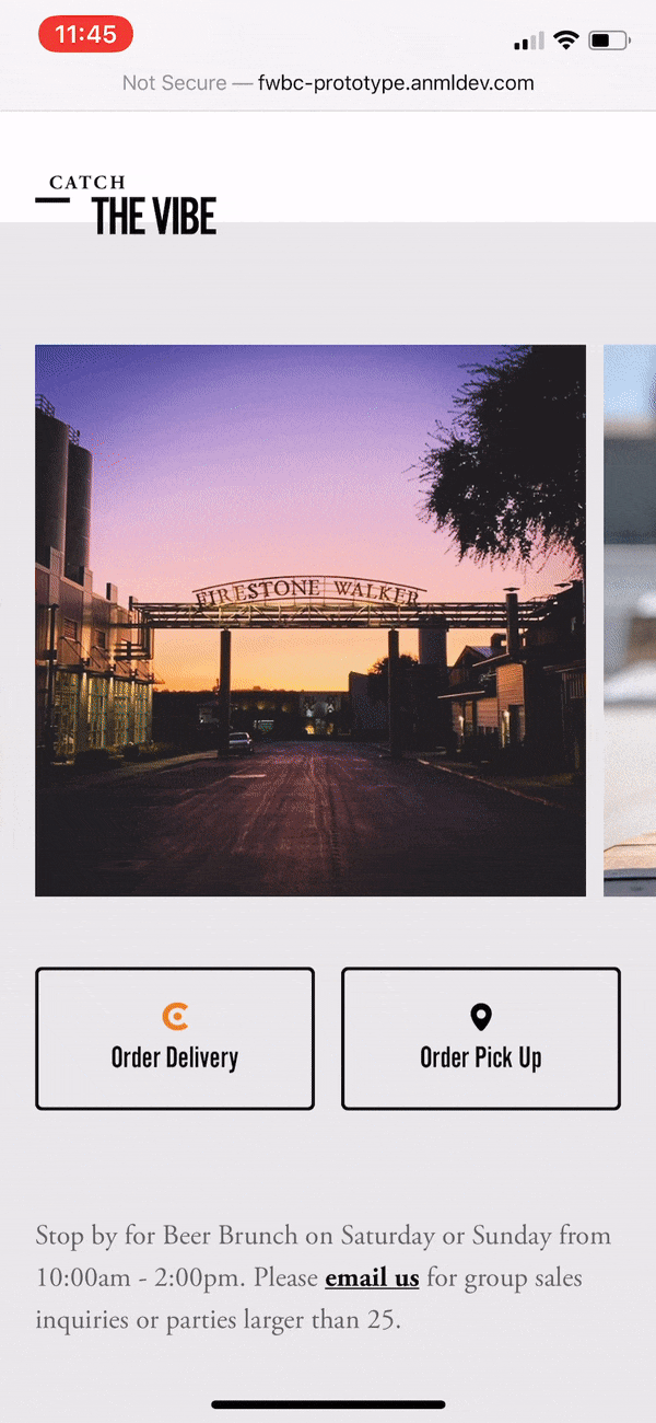
For The Propogator, (one of the brewery’s restaurants), Firestone Walker has partnerships with delivery platforms like Drizzly & Caviar.


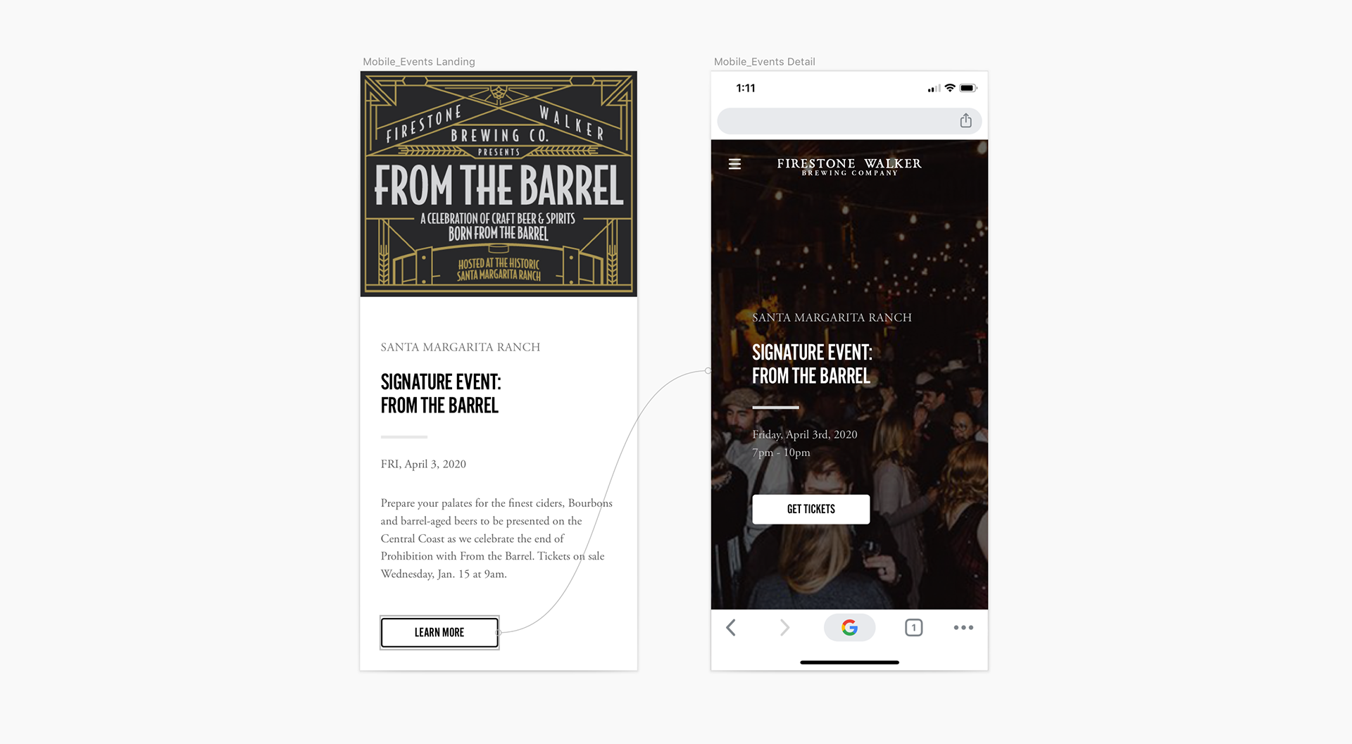
Going to Events
Events from Firestone Walker tend to sell out on midnight releases pretty quickly. I made it easy it buy tickets by providing quick CTA’s right on event detail landing page.

The Other End of the Screen
Pace > Speed
I care about making experiences both scannable and immersive at the same time. If one person has little patience for websites, and another is in a mood for reading or watching a film, I believe they both deserve the best possible experience as users. Think about like this:
One user will come to the Our Beers page just to quickly find that one beer they had at the brewery last week. His favorite are IPA's, so it has to be one of those. Why not make it easy for him to find it?
...
Another user who is an avid surfer came to the Films page to binge watch the Flyjack series. Why not make it enjoyable for her?
It's not always about getting them in and out of the site as fast as humanly possible. It's about getting them the information they need at their own pace.

Comparative Analysis
Firestone said the amount of different text styles & dated modules that made it impossible for their team to work on in its current state. Oddly enough, it wasn't in our statement of work to design for any brand system. So we were hyper focused on creating a scalable template for Firestone Walker employees to use when creating and handling content. We worked with what we had. Even still, the competitive analysis & design decisions we made along the way are really started to shape how the brewery is marketing at scale with cleaner design elements.
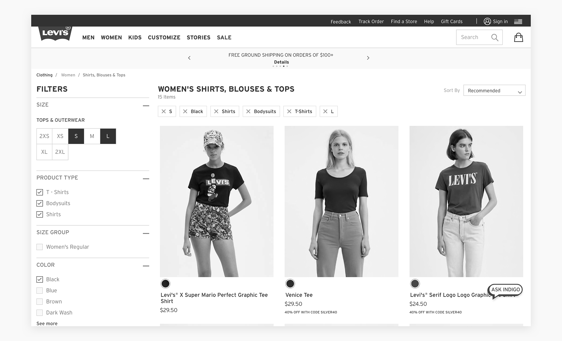
Levi’s has clear a filtration system that follows you down the page a bit, and shows results changing live.
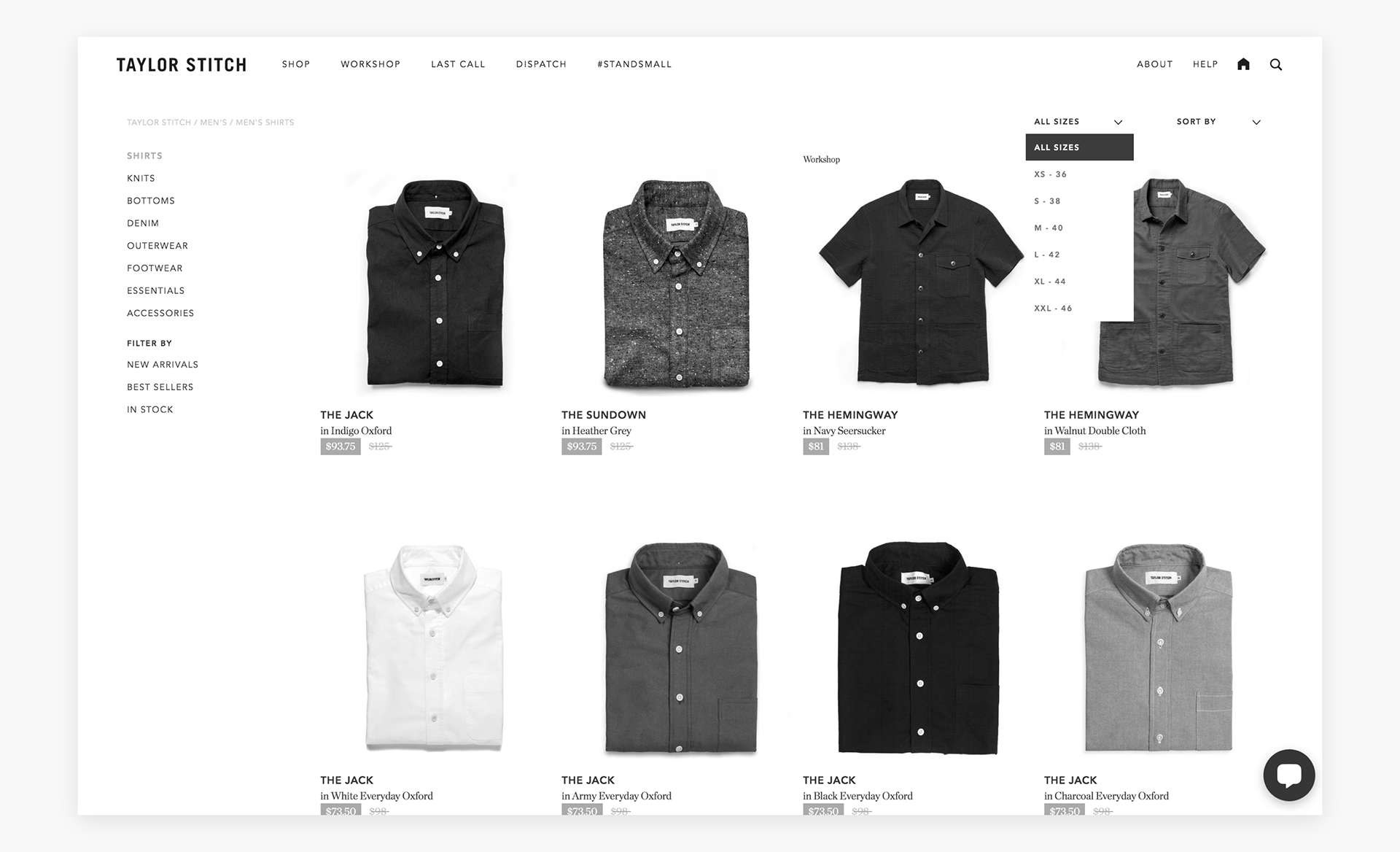
Taylor Stitch has nice, tidy filter modals.

Designing for Accessibility
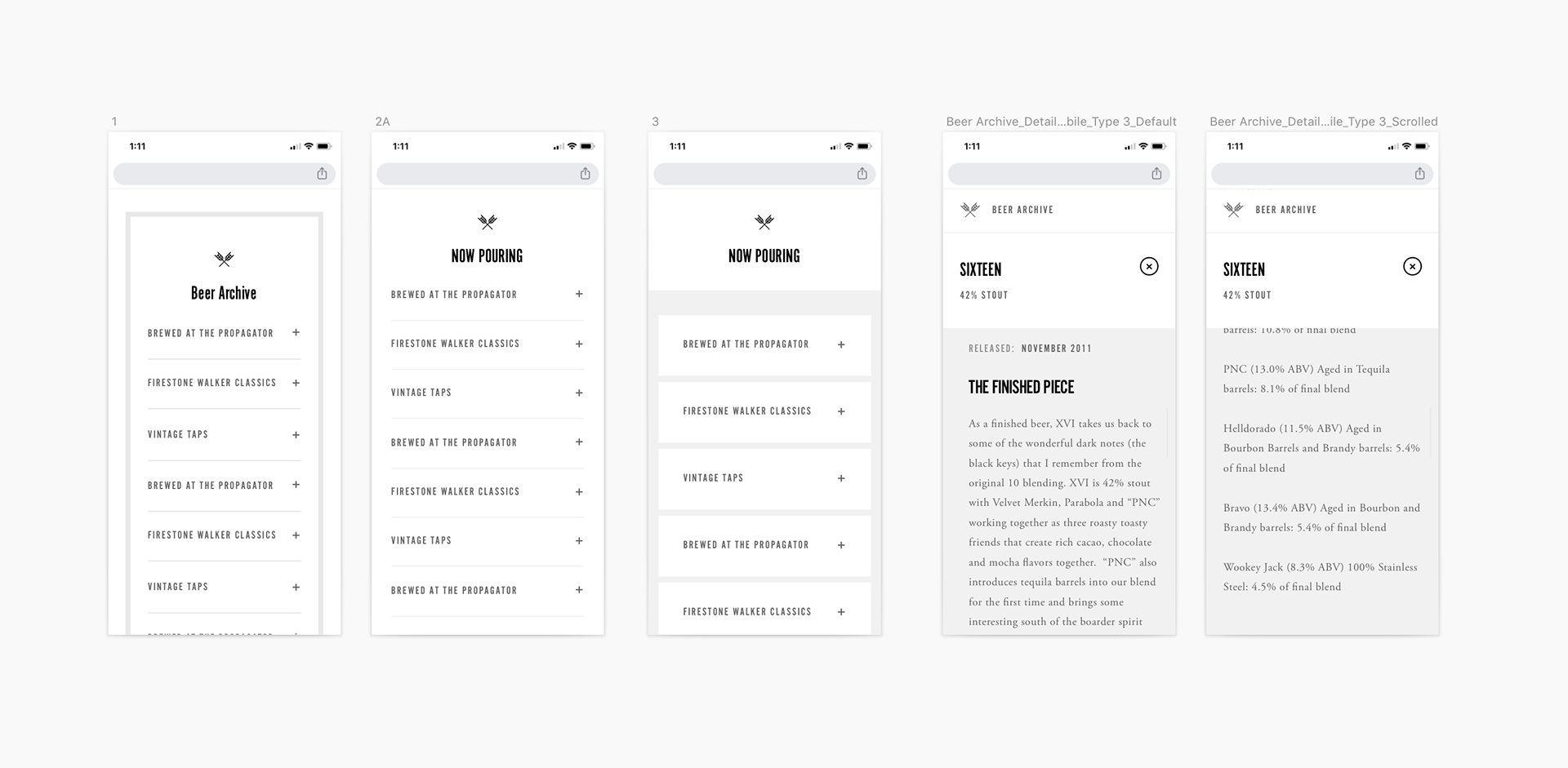
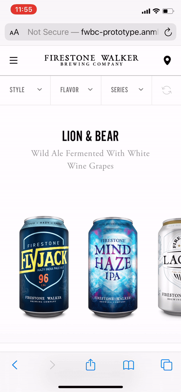
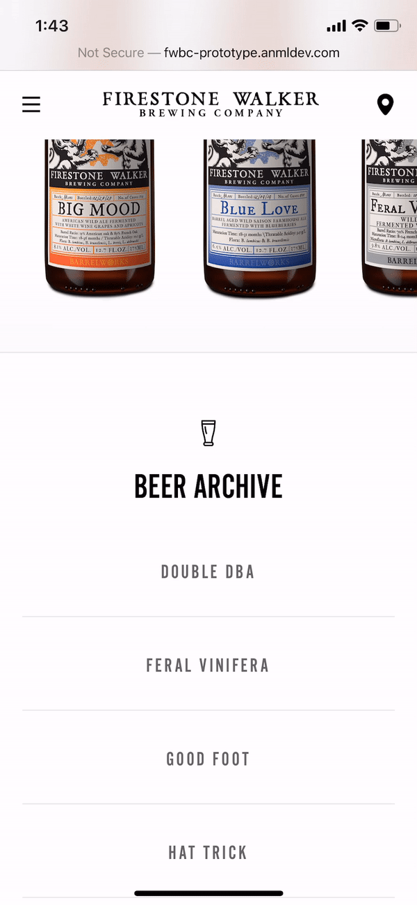
From there, I stylized, and explored. The key to defining the final visual was to share early & often. In general, this helped me refine content decisions in general, and allow me to drive my parts of the site forward. But because of this awesome collaboration, I knew precisely how to size the archive module because I knew exactly how many beers to include — and that it was growing. Regulations on accessibility and alcoholic beverage legal requirements informed my decision making. I wanted to make sure descriptions like an alcohol percentage would never be forgotten. We researched and tested to make sure decisions like the right grays were used, and changed whatever needed.
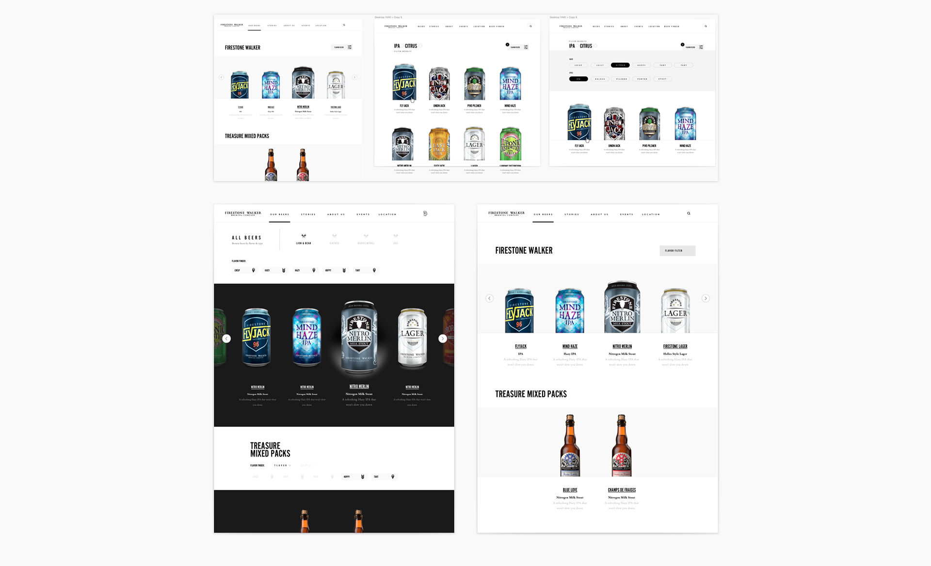

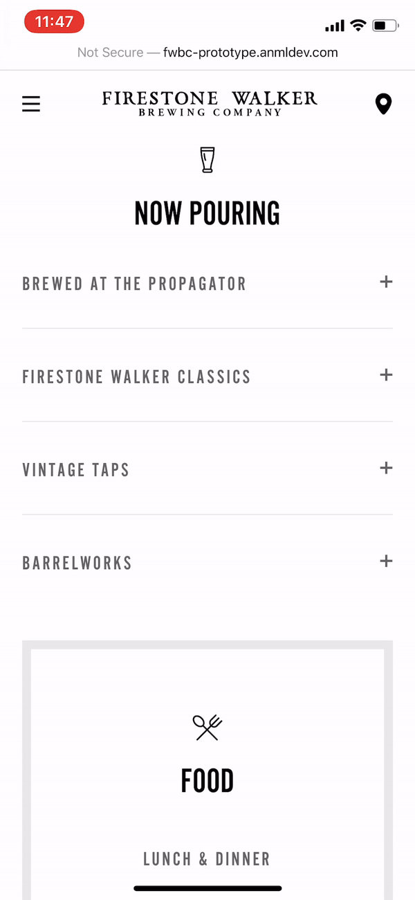
Our Beers Final Design / Math Class
The Problem
There was this math problem I had in college where you were given the floor plan of a museum, and you had to decide where to put the cameras for all the galleries. The twist was you had ensure that the museum cameras could see every crevice of each room, using as little cameras as possible. There was a truth in the geometry which dictated there was actually a correct answer, believe it or not. The approach in logic has stuck with me for years now. This page’s wireframe had been approved, so didn’t wanna change that too much. But when they asked me to instead use the simplest elements possible, I remembered what to do…
The Solution
User Goals
This archive module solved the need to get users the information they’re looking for without redirecting them. In the effort for creating an optimal reading experience, the module repositions itself to start the reader off on the right foot. Because these beers don’t have individual pages to redirect to, readers also get all the information they need just by clicking the name of the beer.
Design Goals
Clear, lightweight, easily implemented & responsive interaction that fit the bill for our timeline.
Business Goals
Easing the CMS process for the client for scaling of content over time, as more beers are added incrementally.


Okay, I know I talk a lot about content...I'm aware how people feel about using this phrase, but seriously: content is key. For anyone who might disagree, I'd consider this from the client perspective:
When you're a company that sells beer, showing the beer is pretty important.

Outcome
My job was to craft ways to easily navigate the site, and animate an interaction behavior using the simplest elements possible. We spared heavy visuals for the highly trafficked sections that needed it most. In the end, we achieved a buttery experience that was both noticeably custom-crafted, & technically realistic in an accelerated timeline. This system worked so well that development moved faster than scheduled, and the components designs will also be applied to the 805 website.
I think overall the build turned out well, and the wireframing process truly formed the basis for a strong overall digital presence. The client is very happy, and as excited for the site as we are. We streamlined the user experience, and we can’t wait for the feedback to see what we can fix and take forward.

Having great assets to work with was invaluable. The awesome photographers behind the lifestyle / product shoots:
• Ben Geise
• Cana Snow
• Colin Nearman
• Dylan Gordon

Project Status:
• Live