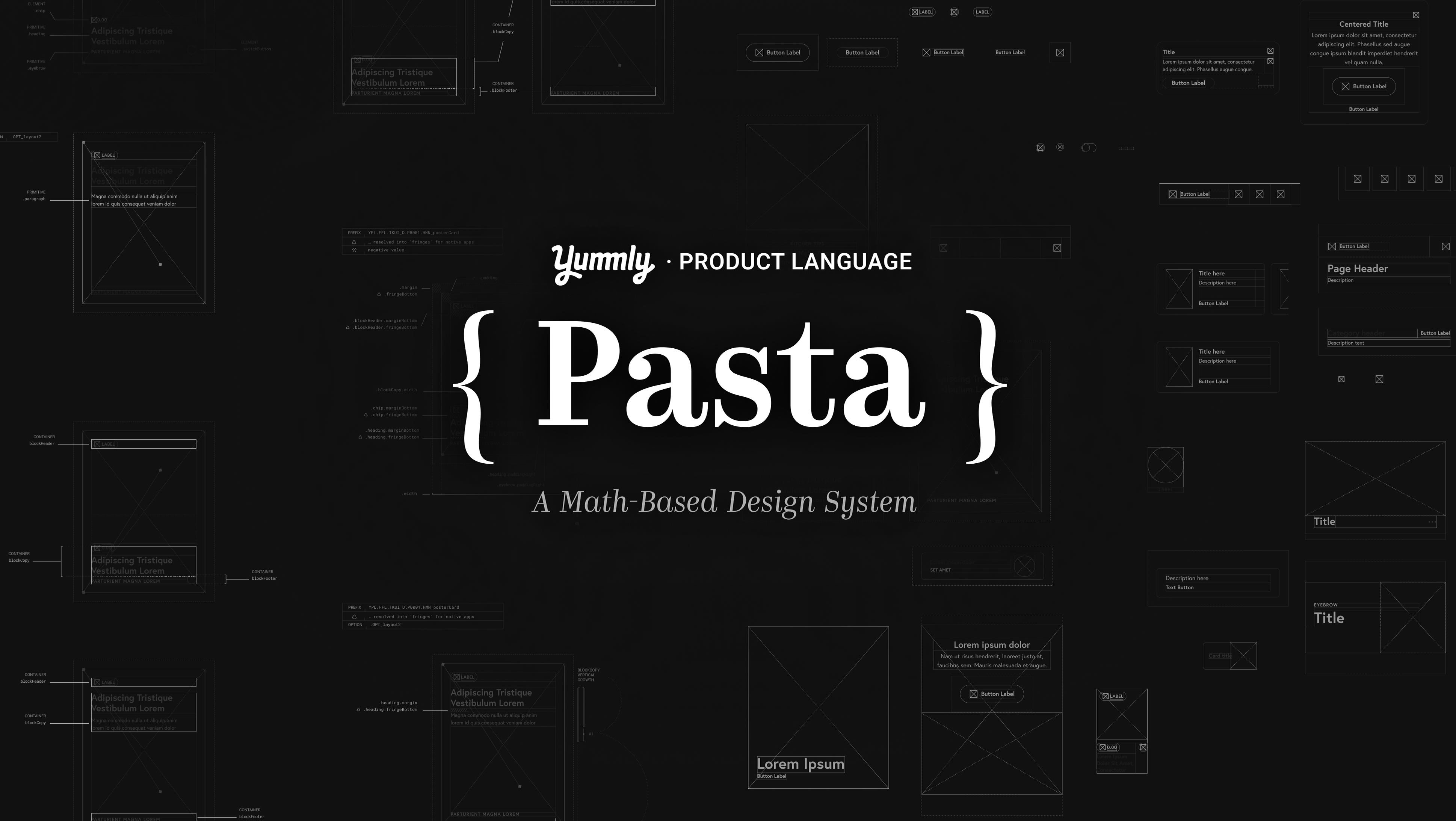

The Ask
Digital Product Design / IOT Integration
Client • KitchenAid
KitchenAid’s rich history as a home appliance maker is definitely something to be valued. Where it falls short of buyer’s expectations and quality assurance however, is in on the digital front. ANML was approached with the ask of designing the vision for an app that works as a remote control of kitchen appliance features, and inspires users to create with the powerful tools they have.
• Visual Rethinking: Want to look modern, not tired.
• A growing home feed with content valuable to a creator.
• A digital product that allows for experimentation.

“We don’t want to get in the way of passion to create — we want to enable it further.”

The Flight to Ann Arbor
For a household name brand like KitchenAid being over 100 years old, they’ve built a pretty decent — if dated — reputation. They wanted a fresh take on the KitchenAid name, and better recognition at the same time. Their appliances today kick ass and look modern, so why not make the digital product be a compliment that reflects that? Some conversations are better had in person. ANML’s leadership took a trip out to Ann Arbor, Michigan, for a week long workshop to kickoff the project. They spent hours each day immersed into the problem space, and when they returned, they brought back a gold mine of information. Their user and business insights from the trip would come to be invaluable to me.
We learned that KitchenAid has spent years digging into kitchen appliance analytics, speaking to buyers, and has synthesized their research to identify something of a user persona. We learned a lot about the brand’s rich history and values of being story driven, because words matter. We’ve since shaped it into to something ownable and concise. At its best, the KitchenAid brand is passionate, inspiring, open, and playful. KitchenAid highlights one’s passion for doing with the content it produces — it exists to compliment their craft. But exactly who are we speaking to?

Meet The Maker
The User
You’ll find The Maker is the usually one with an apron already coated in baking powder. She’s someone who likes to get her hands dirty and create.
Makers come from all walks of life, whether they’re filming a DIY video for their Youtube channel, or baking a fancy birthday cake. For some, it might just mean doing what it takes to get dinner on the table. For others, it’s all about searching for inspiration, and loving the process of mastering a craft — that means something a little different for everyone, but at our core: we all have the ability to make.


My Role
There isn’t much of a digital product out currently, and what does exist is far less than ideal. I was asked to work within a subset of KitchenAid’s appliance’s technical limitations, yet provide a design stands in both a utility and inspiration space. So without being able to reinvent the aspects of something like an oven’s capabilities, the task was about manifesting a sense of beauty in remote control. I believe one of the best ways to do this is simplicity, so as I started sketching & ideating, I applied that mode of thinking to every exploration I did. At its core, this is a digital product that allows for experimentation in the kitchen. Our job is to set the tone, then step out of the way for them to create.
Tasks:
• Design for The Maker persona.
• Drive the visual for the app experience: (photography, language, elements).
• Clarify the vision for the user experience.

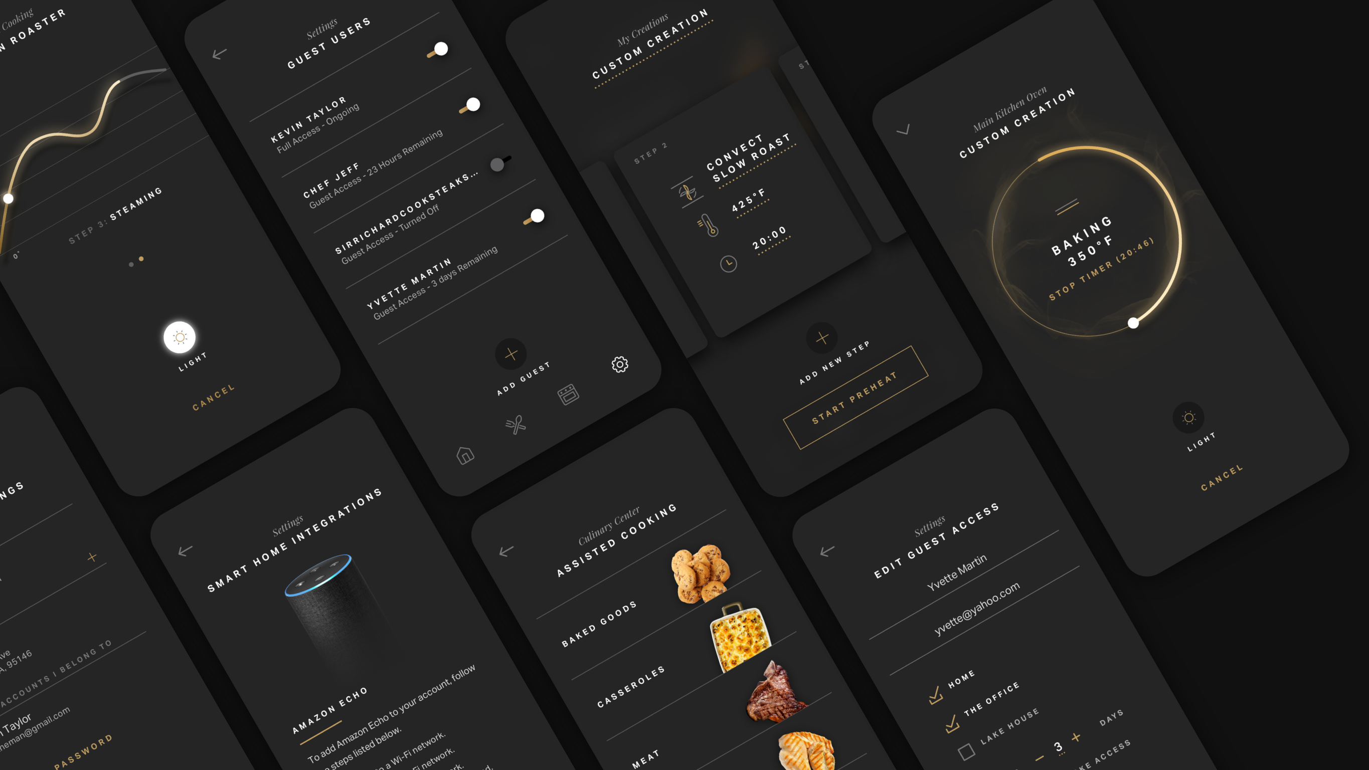
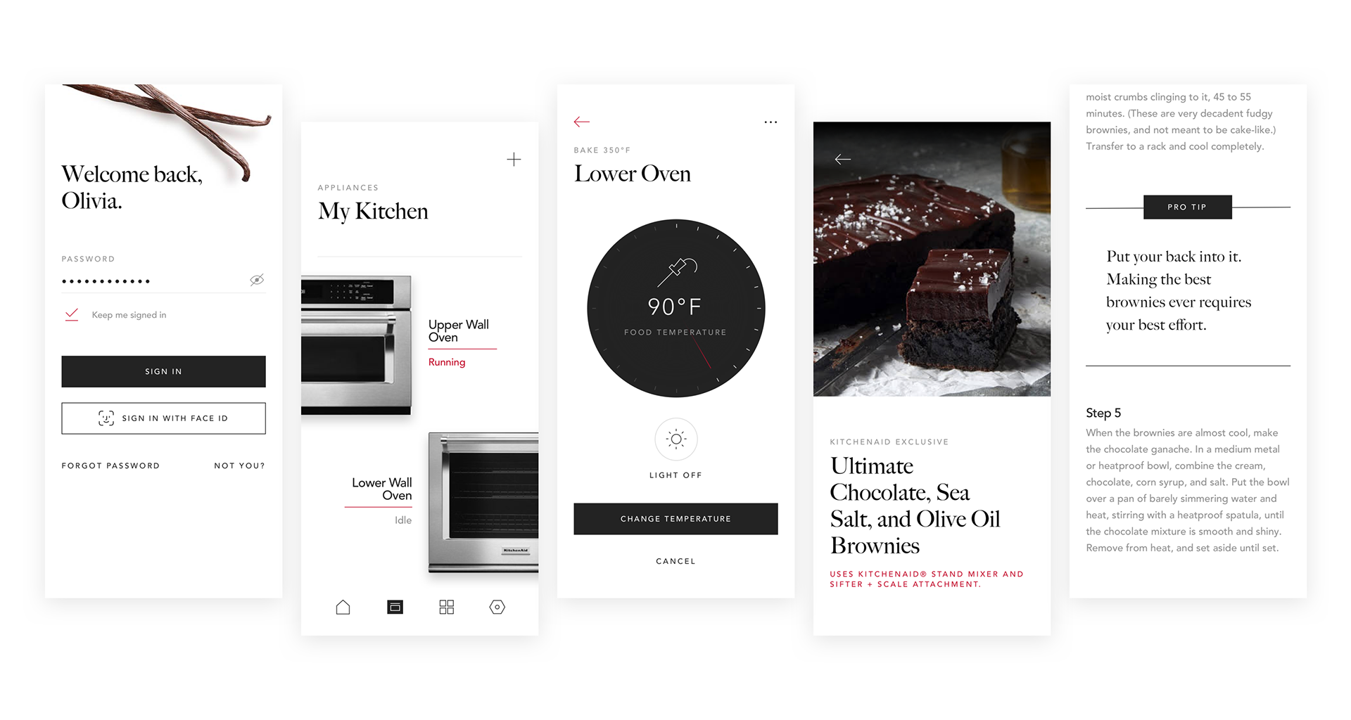
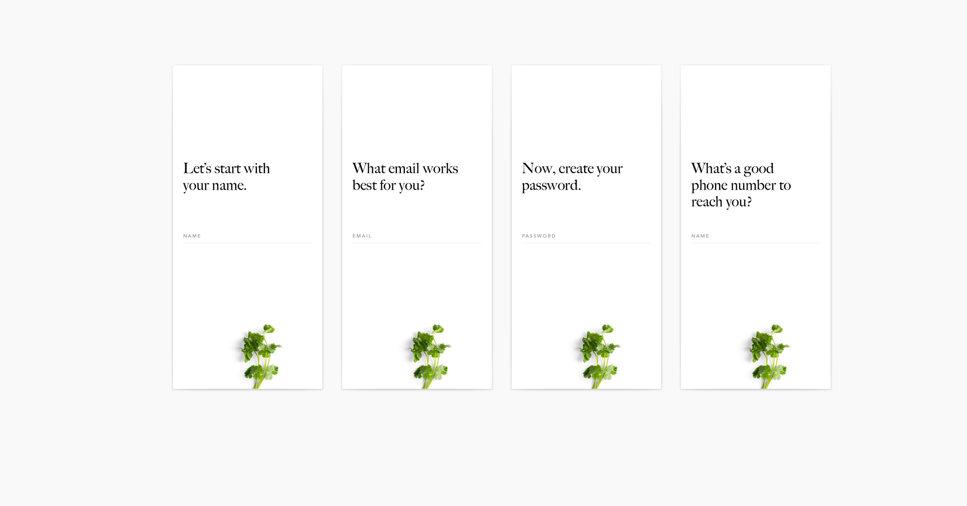
Sign In
I still wonder how not every app out there takes advantage of such a brilliant biometric technology in Face ID. Something so simple as not having to touch the screen when your hands are dirty struck me as a perfect pitch to the Maker.

Exploration
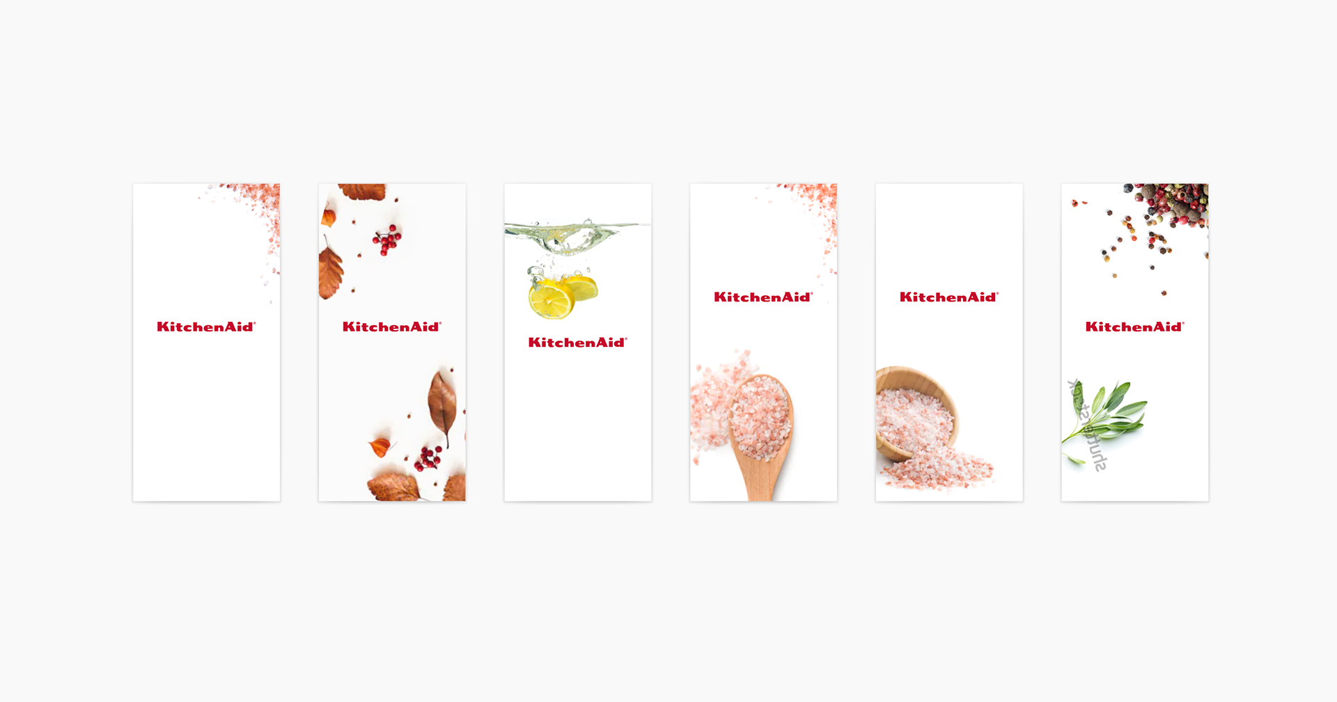
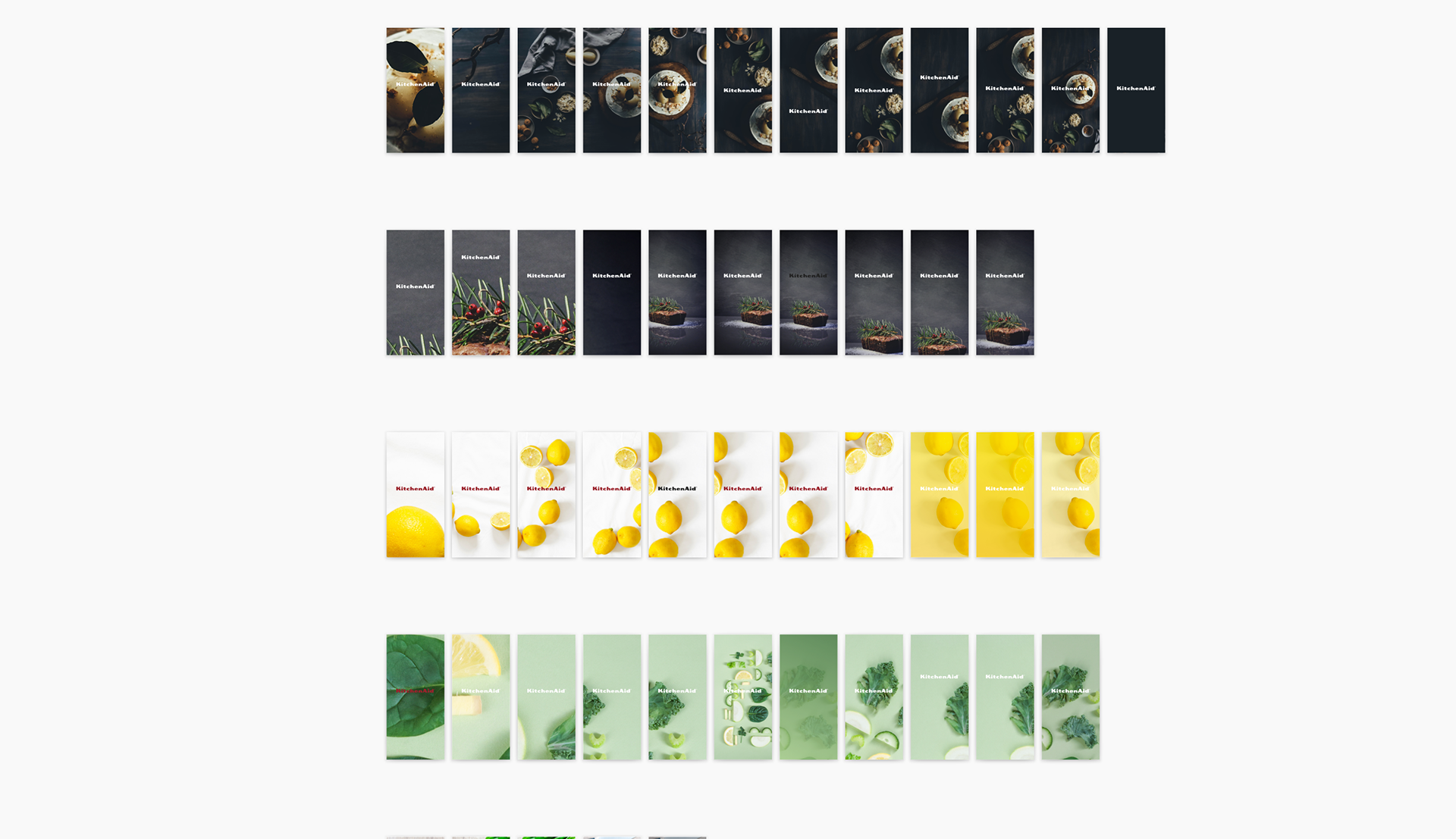
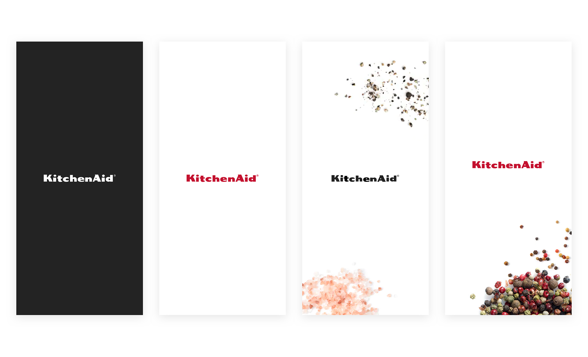
As I ideated, I thought about what touch points like the splash screen could look like, in order to help to visually articulate what we considered to be playful, or messy.


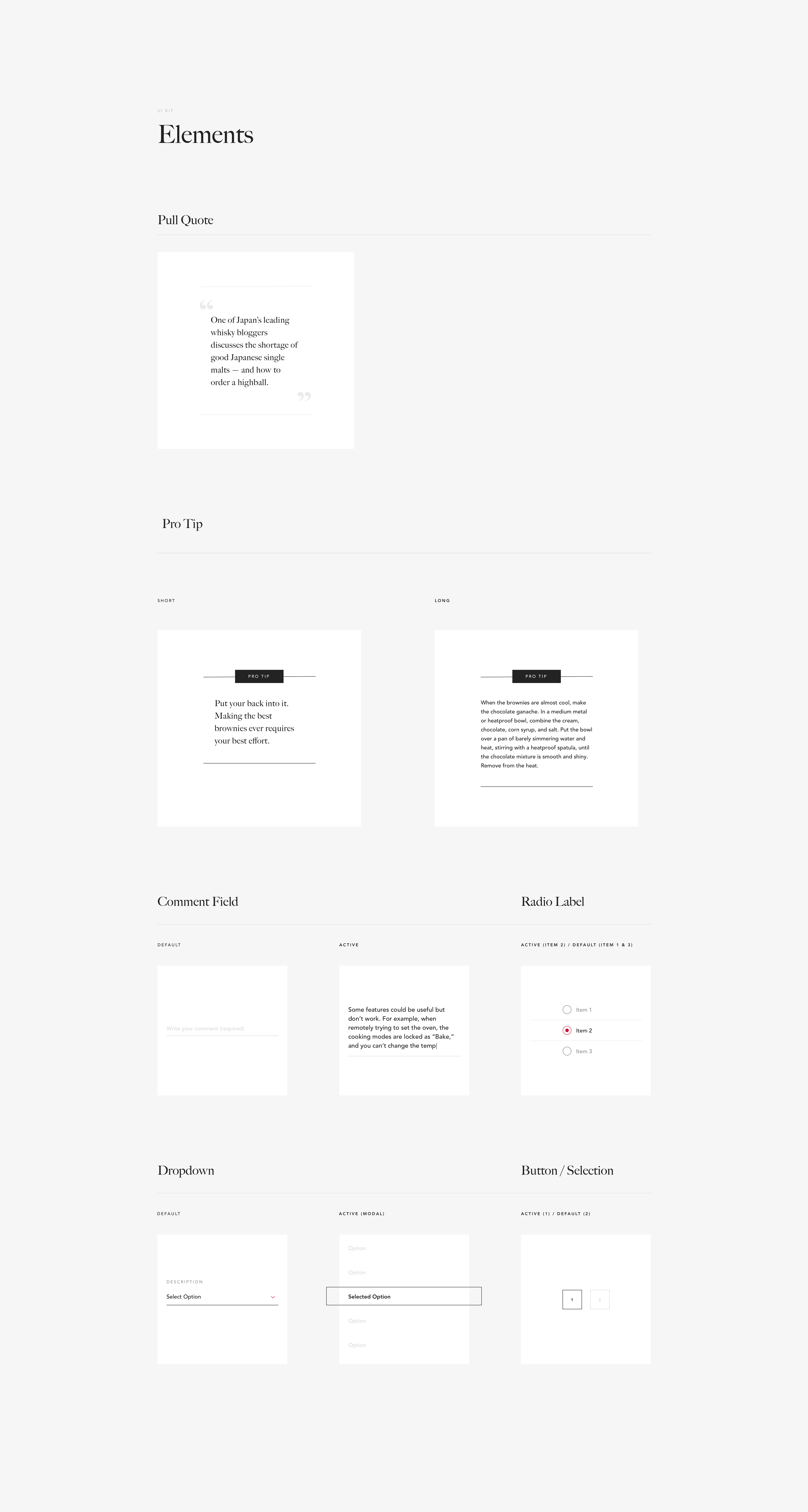
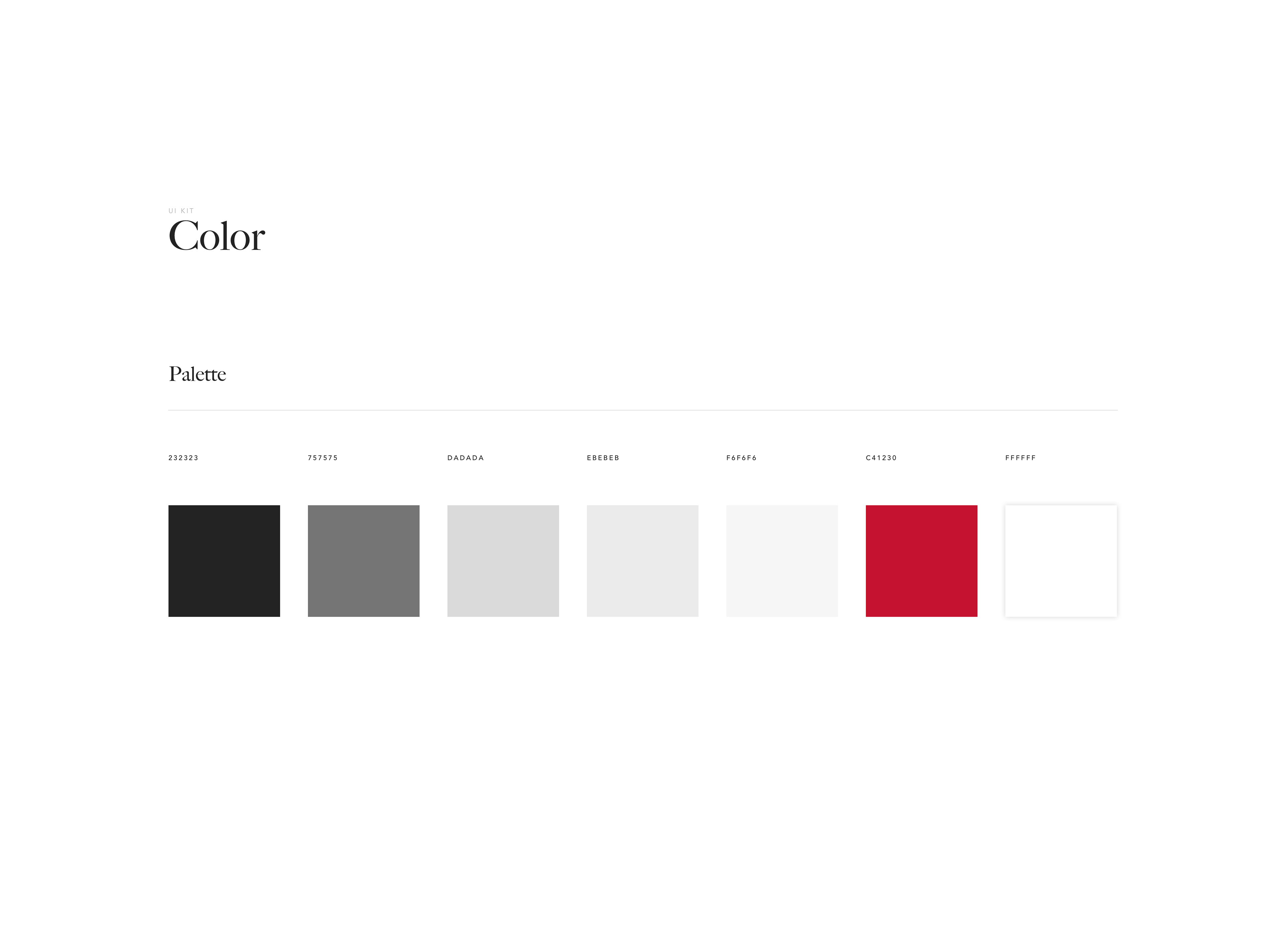
Just a few snippets of the UI kit.

Something I’m starting to see come up a lot since the Whirlpool work started last year is the idea of this dialogue. This was no exception. Still, the aspect of dialogue needed to carry over in a utility space, not just just the inspiration space. Below, a work in progress minimalist dialogue concept.

Home Feed Content
The remote utility part of the app was critical in the user journey. But equally as pressing was the approach to content. We considered peaking their interest with better content throughout to be a great supplement to their experience, introducing it early in the user journey.
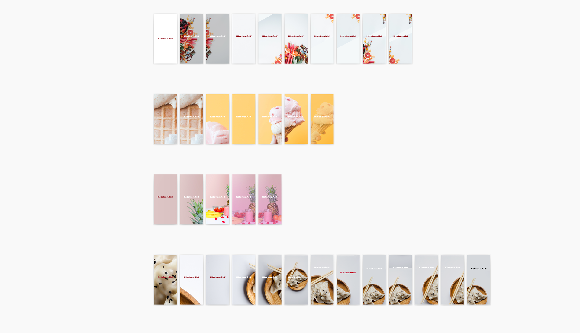
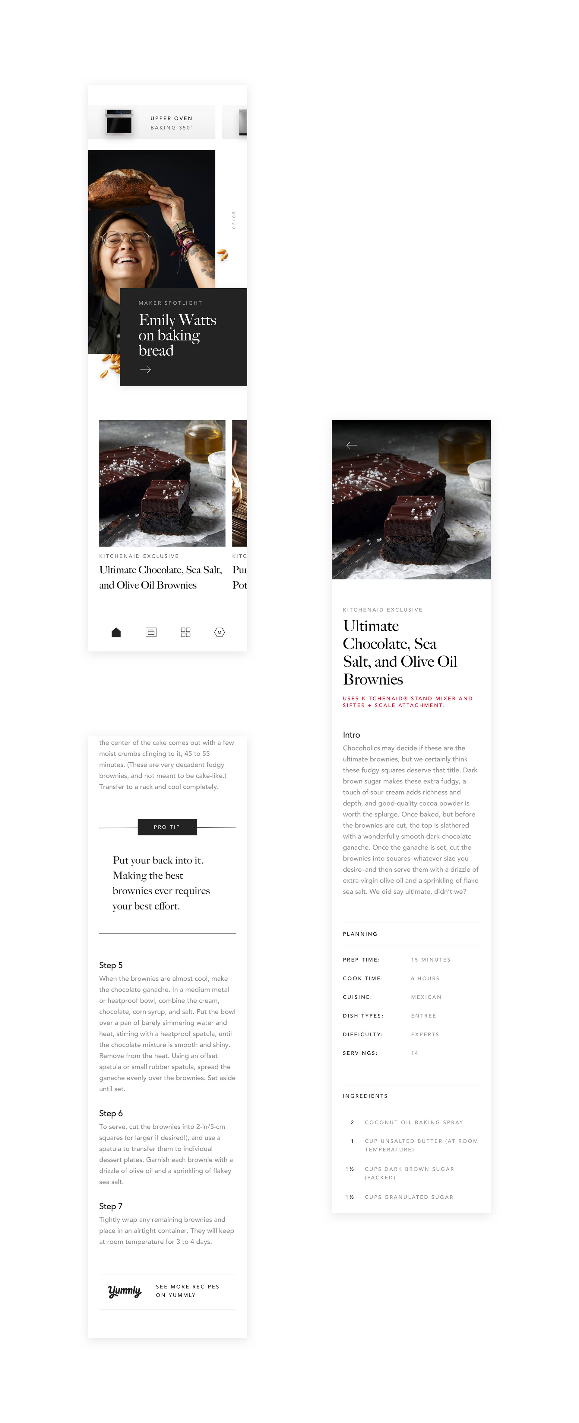
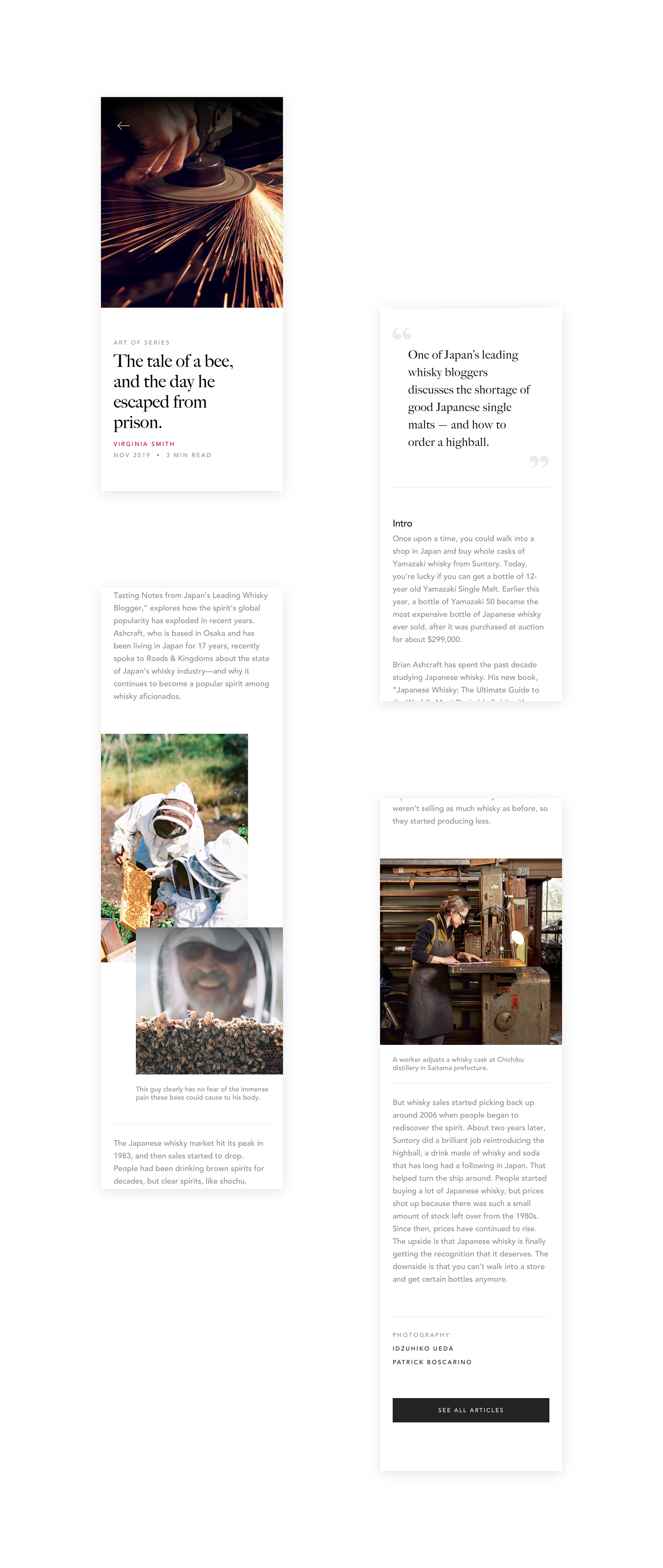
To address this, How To’s would be contextual to the kitchen product they have. Always curated, and with varied layout components alternating between full bleed imagery and experimental photographic crops, we built pages with a deconstructed interface that references the analogy of the messy kitchen. We worked to display content in a way that might inspire: we showcase our series like Maker Spotlight, Recipes, and The Art Of Series.
Because they’ve has taken the time to connect their product to the app, we wanted to reward that in a way, and bring it to life on the home screen as well. At the top of the feed, (even after closing the app), a Maker will always be able to tap back to their oven, should they need to.

Journalistic Content
Photography choice is always important for addressing any design issues. Luckily for me, in this case I was working with actual content. We didn’t have much as first, but the content team has been hard at work in Michigan, and there is more being produced likely as you read this. Above was an actual KitchenAid recipe. We wanted to prevent being too prescriptive or limit creativity, so a simple read gets them started as they explore more from the home feed to discover exclusive recipes. For reading the stories of other Makers mastering their crafts, we could apply the value of in-process photography.

“Let your creativity boom.”

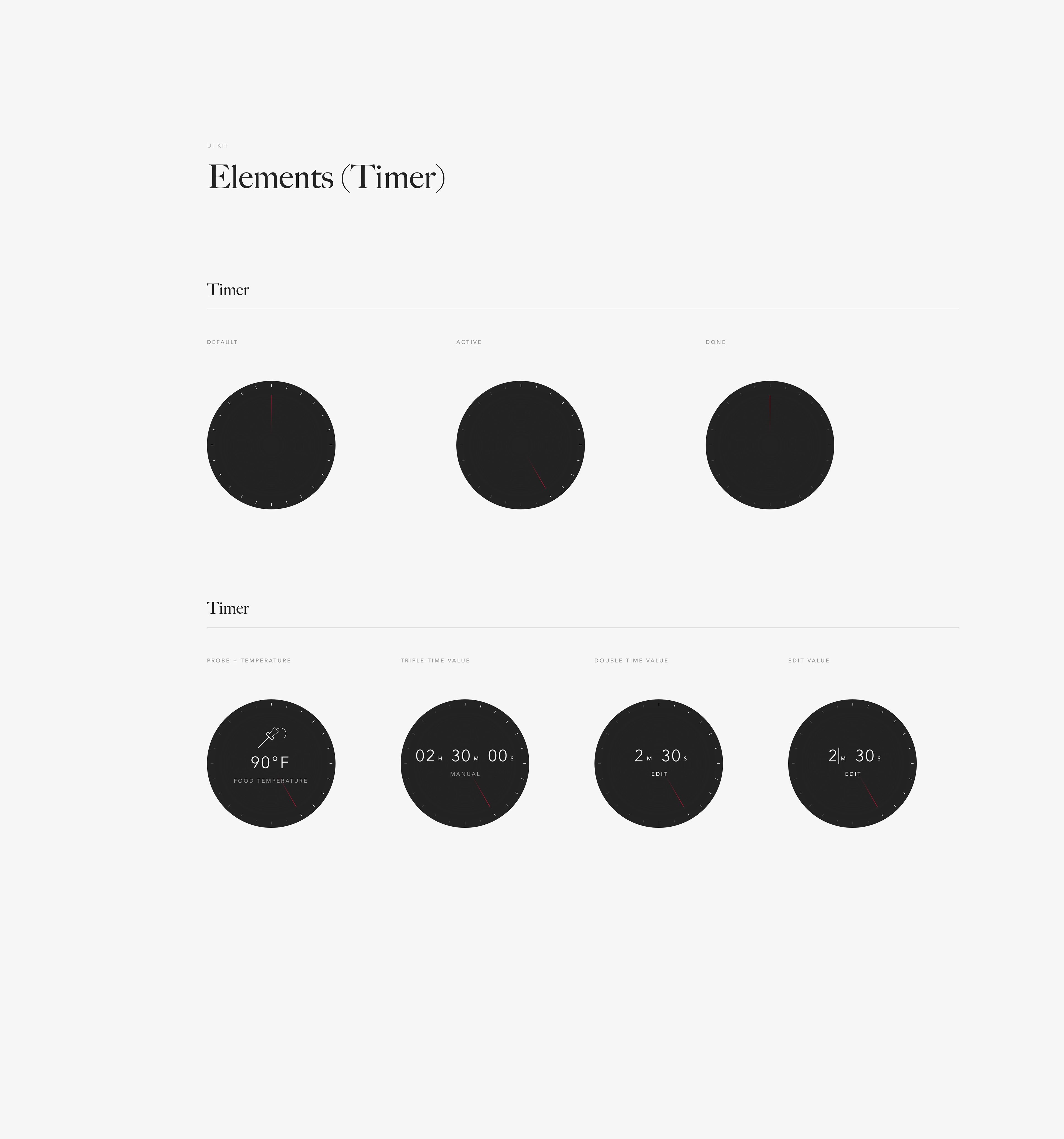
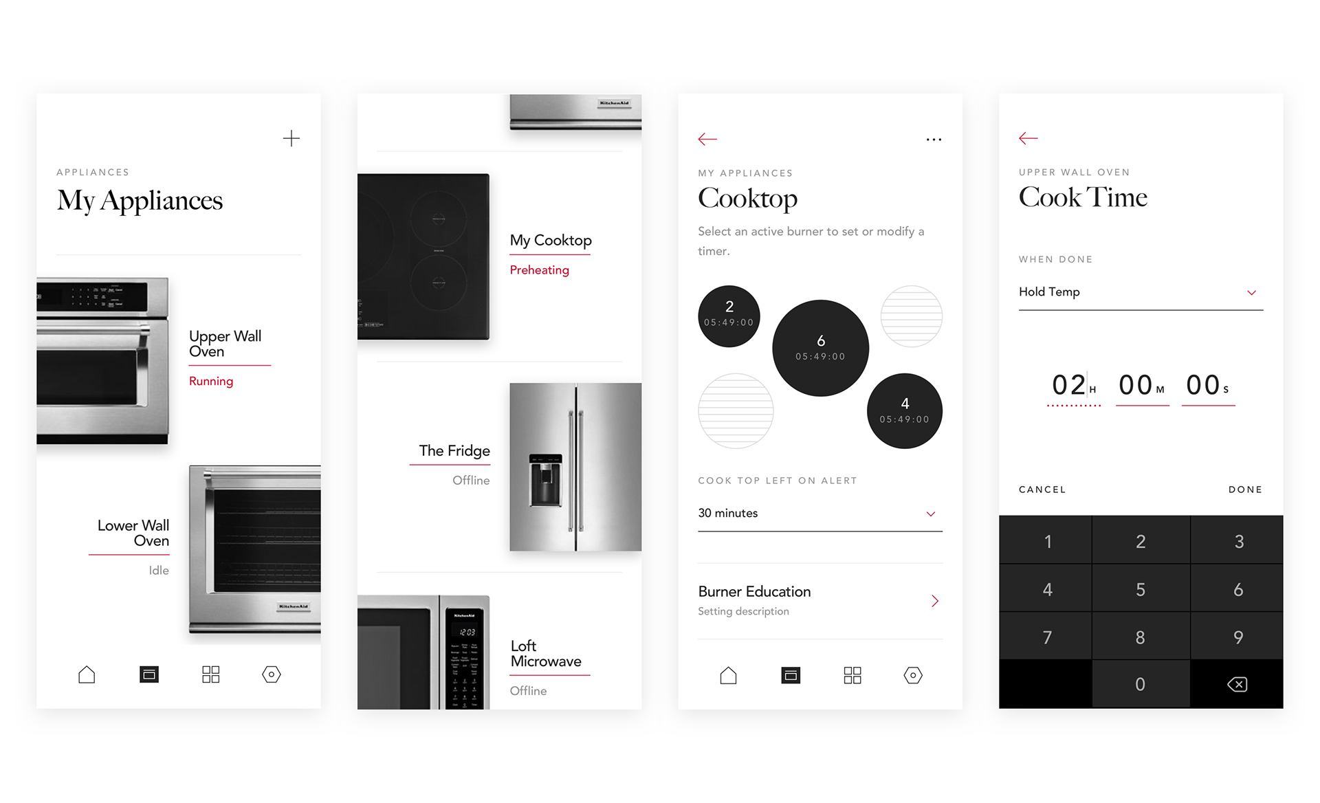
The Timer
“Please: show what's needed, hide the rest.”
Kitchenaid’s test insights told us that users who wanted more sensory engagement. For example, there were explicit, (and often harsh), comments asking what kind of kitchen timer has no sound? Those who for whatever reason weren’t interested in the native iOS timer capabilities, or whose hands were simply too dirty touch their phone needed a familiar way to see how much time they had. Though we tried several variations, sometimes a ring indicator doesn’t cut it.
In designing for condition based components, the logic trees behind an oven’s electrical engineering are a little outside of my realm. With KitchenAid’s engineers doing the heavy lifting on the back end to integrate things from haptic feedback to pinpoint oven accuracy, I was able to focus on adapting my vision for a minimalist kitchen timer experience. The timer winds up by itself, and runs counter clockwise just as you would expect:

Ready...
Set...
Bake.
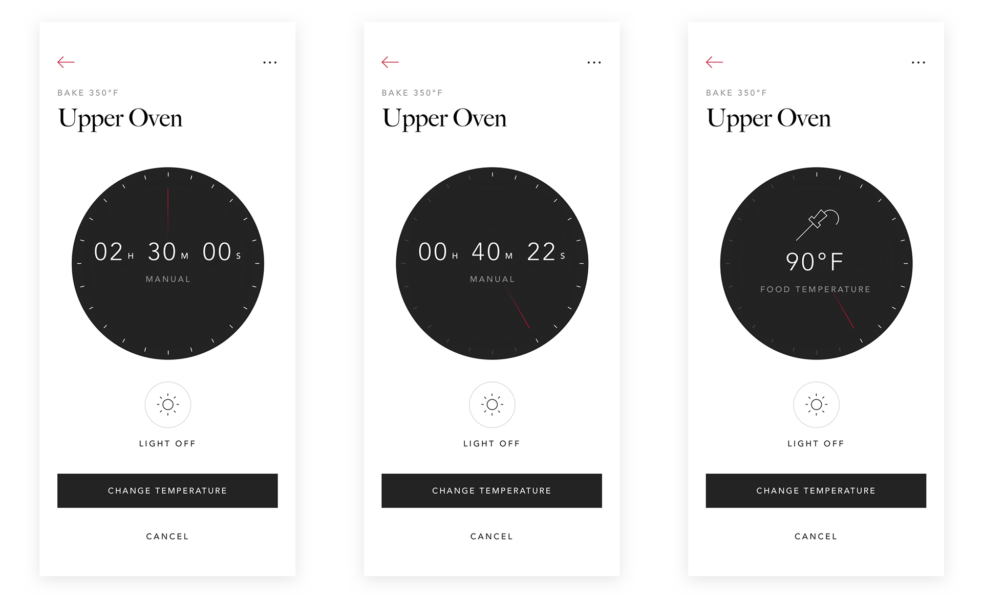

There can be a variety of ways the pre-cook process looks in different contexts. One user may have several appliances. For another user with a cooktop, they can remotely control individual burners with a tap. Others may simply want to set some ground rules for their wall oven before they start.

Utility
When we inherited this project, the appliance flows and functionality were largely thought out - we couldn't change that significantly. Because we were brought on board to develop mainly visual design, our creative approach would become be a driving factor.
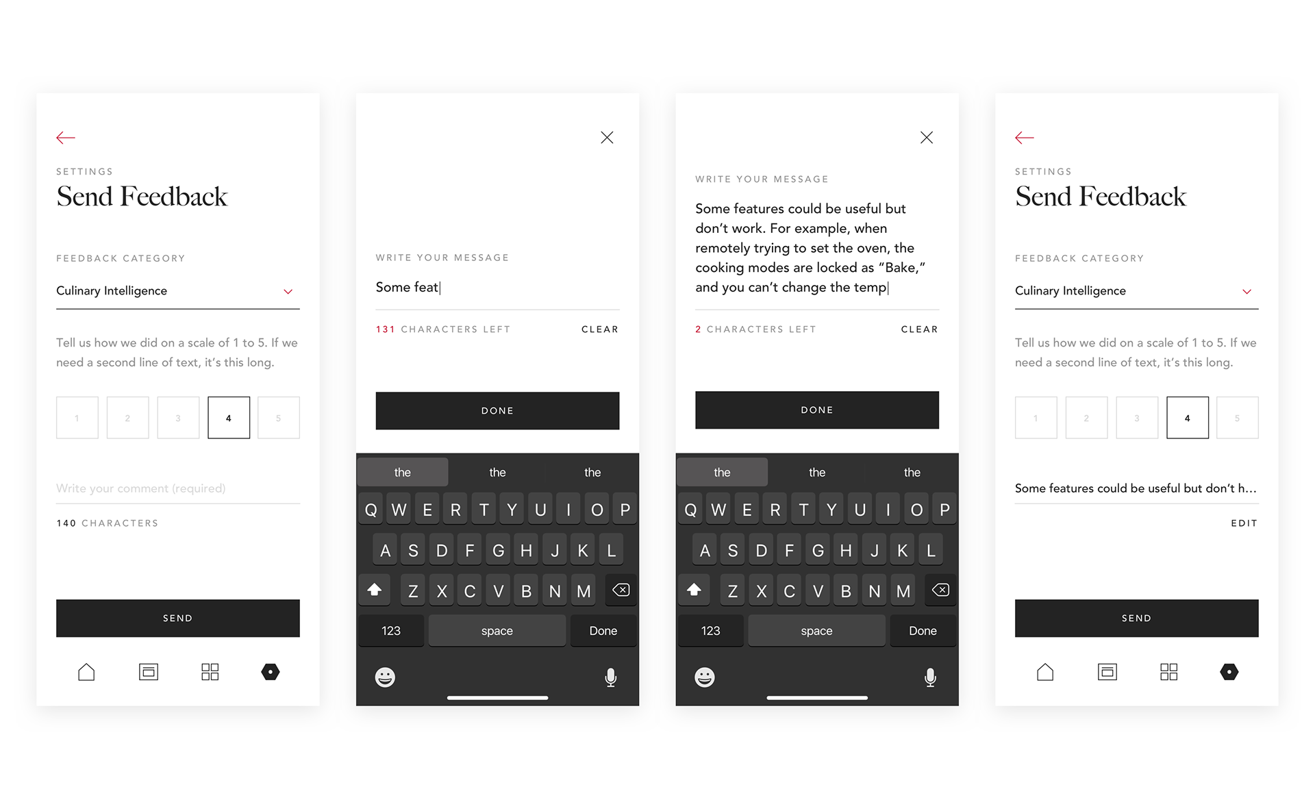
Receiving and acting on user feedback is what will enable the future product to have any semblance of success in the future. I wanted to make an easy process for users to leave feedback in the first place.
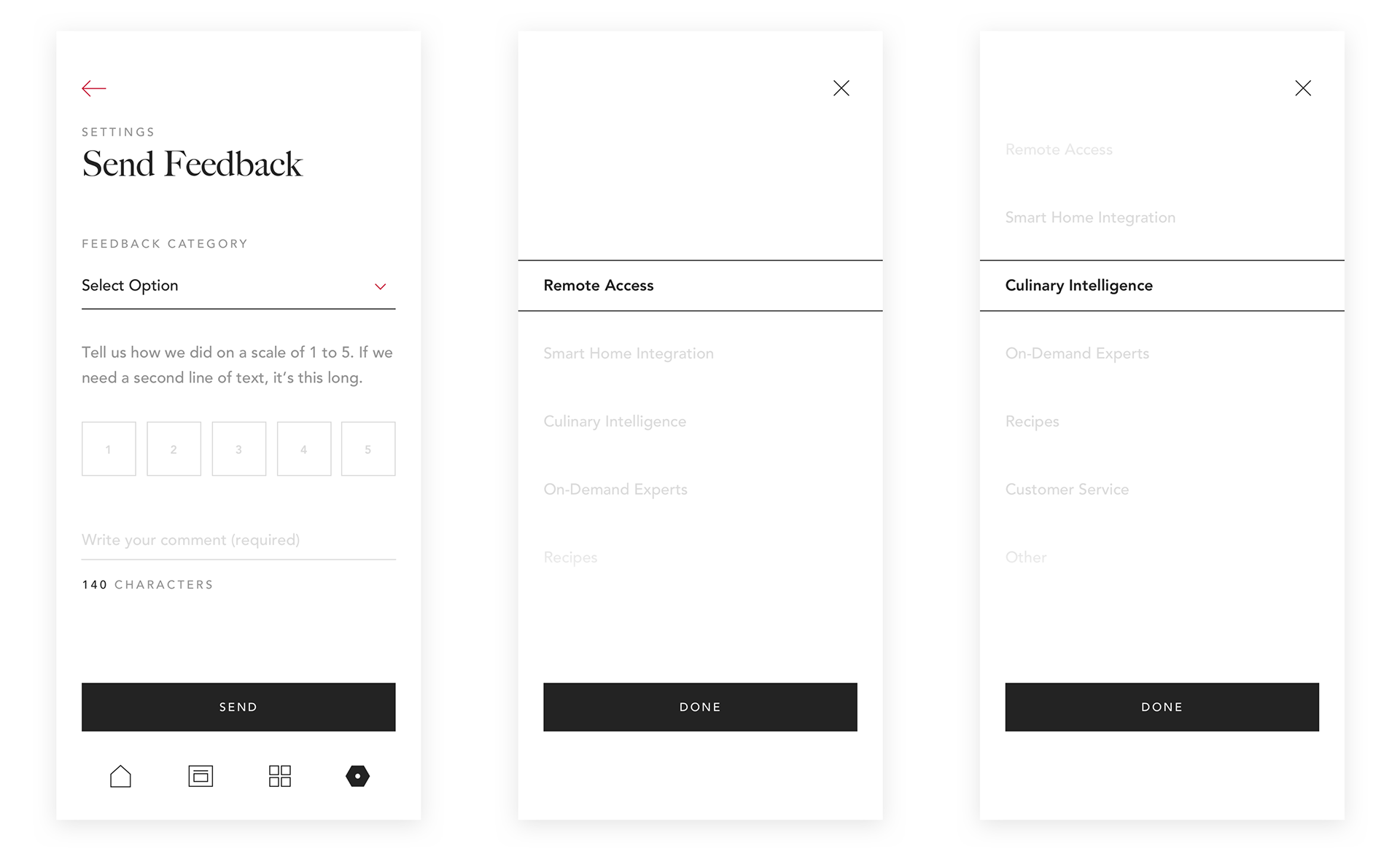
A dropdown module expands to a full screen tumbler with category options.

Pairing
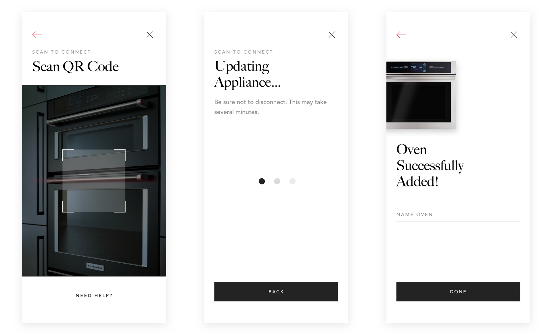
Documenting a new appliance as part of the onboard process with a simple scan of a QR code is key to providing both user insight for KitchenAid, and a relevant flow of home feed content for The Maker. Kitchenaid has some pretty impressive technology hidden in their belt. Below are a few selected screens to give you an idea of what that looks like.

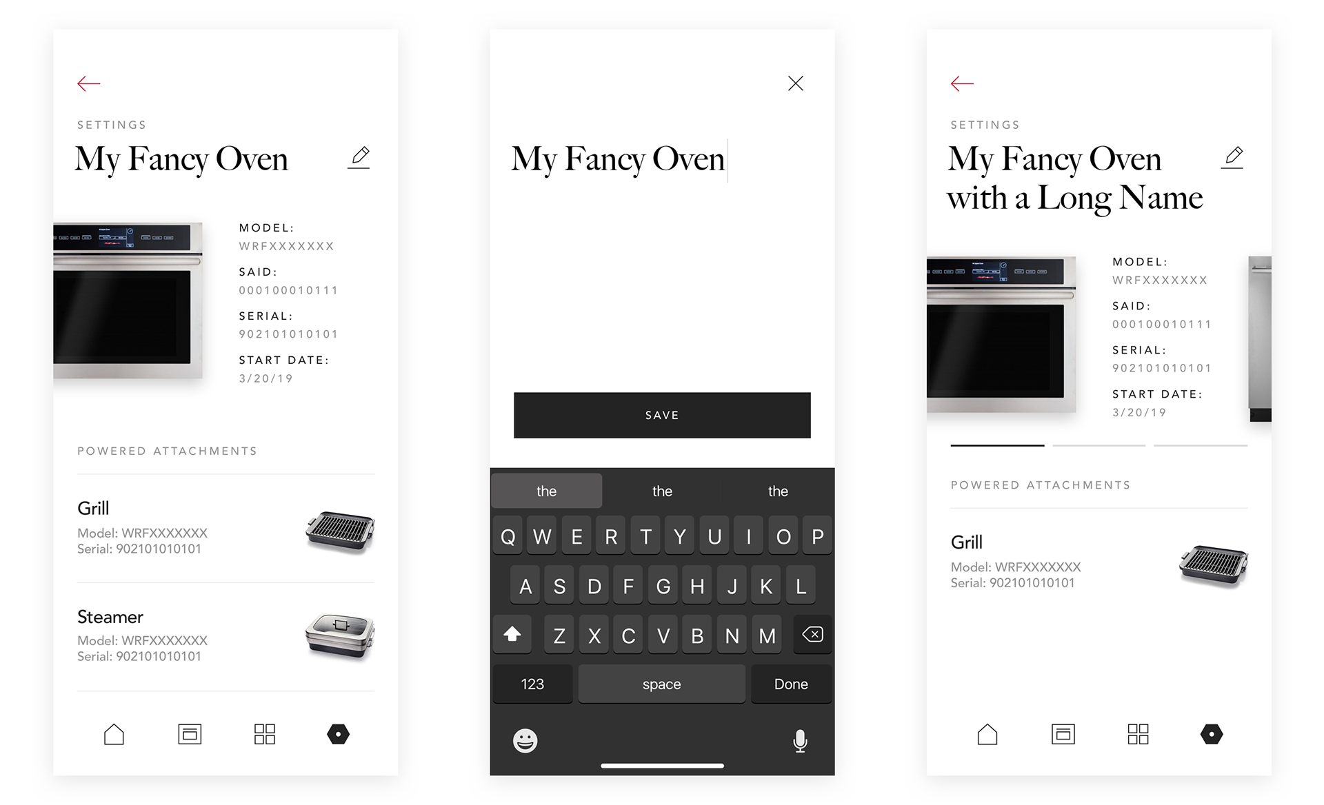
Personalization
A Maker has her own taste, for sure. She has the ability to get information on her one or many appliances, and change their nicknames as she pleases.

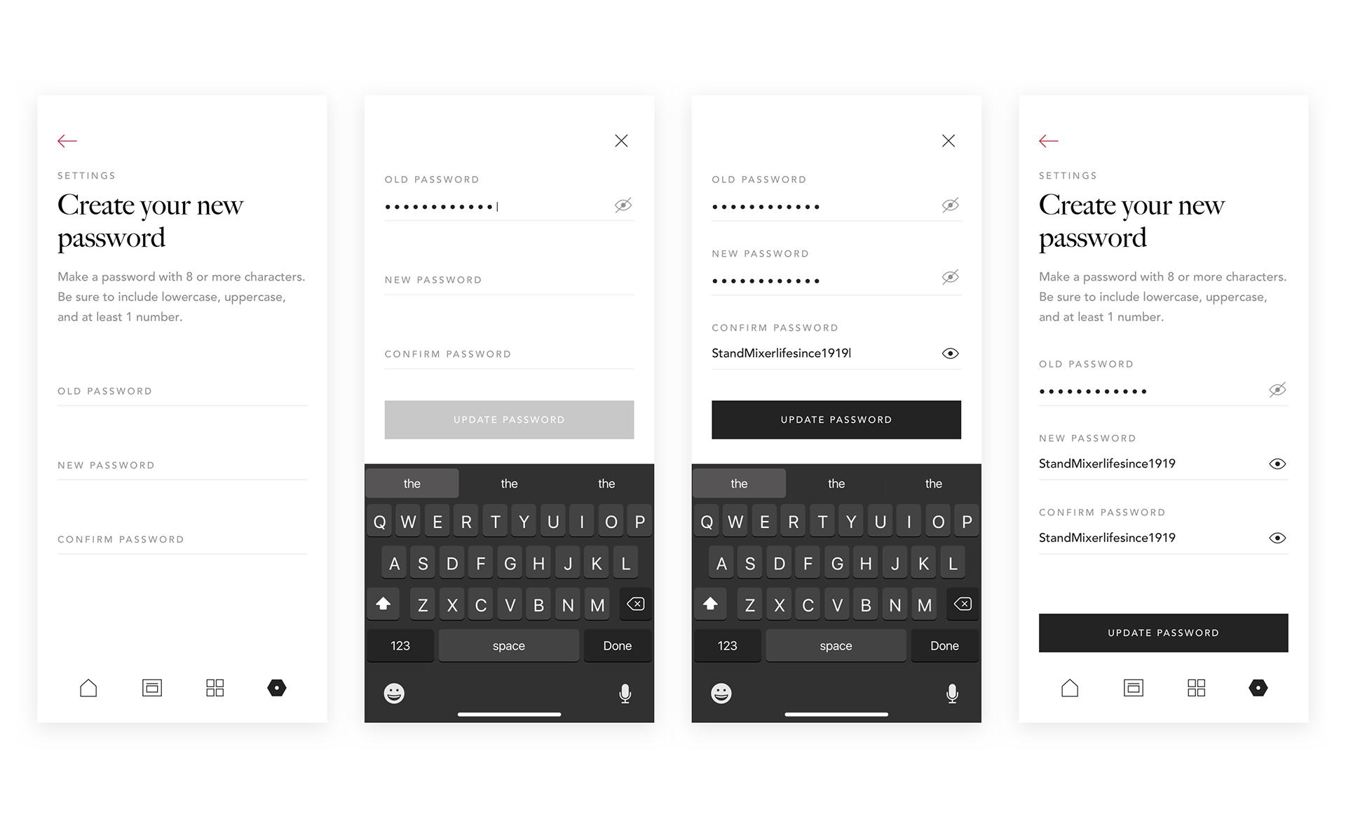
It’s the little things. And sometimes those things are due for a change: I’m looking at you, passwords.

Outcome
I was happy to see that once the final round of design was approved by stakeholders and executives, the stylization has started to make waves in the brand department. It’s influencing the company’s web work already. This design language has altogether set the stage for future KitchenAid work, bringing the brand closer to a position of elegance.
ANML has subsequently been signed on for two new contracts of work, and we feel we’ll continue to be able to influence KitchenAid’s digital product strategy and smart home integration endeavors in a positive way.

Project Status:
• Shipped