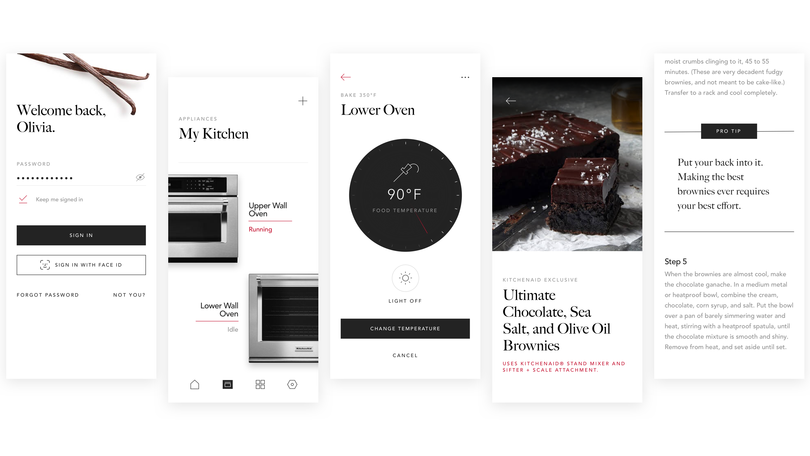
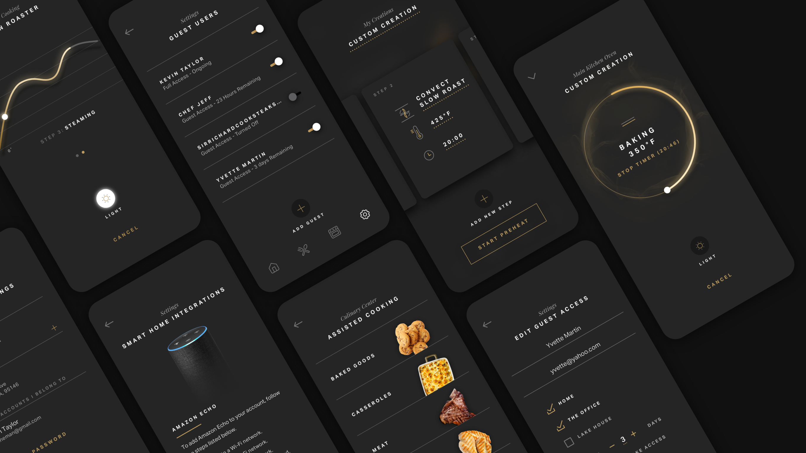
Preface: Meet the Chefs
My Role
Pasta Committee Curator
As a Senior Designer, I led the design effort in the "Pasta Committee," acting as the knowledge source, and primary design resource for "Pasta," our initiative for a global design system.
Chapter 1: Stale Noodles
The Problem
Yummly had a chaotic and mismatched product platform.
User Needs:
• Users are enduring an aging and fragmented discovery experience.
• Accessibility is unable to be addressed, resulting in a company lawsuit.
• Localization and "internationalization" of the app is a logistical nightmare. Time and money lost on avoidable Design QA.
Business Needs:
• A rich plethora of Yummly content is functionally invisible. It's not being surfaced well enough to users.
• Impending rebrand, but we have a cumbersome design process.
• Devs are working without a component library of any sort, WHATSOEVER.
(I'm somewhere eating a Hot Pocket as you read this, but I can still hear you gasping in terror — don't worry, I did the same when I heard).
Let's start with the state of Yummly...
• Reactive design process
• Siloed teams
• Devs build without a component library
• High cost of implementation
• Siloed teams
• Devs build without a component library
• High cost of implementation
There're too many unique “solutions” for similar problems. Each of these are what we call our "Homefeed." Look how different they all are...
Before we could solve anything, I needed to first understand who our users were. I started with our key user personas.
Users set their recipe preferences during the onboarding flow.
How might we leverage this to inform the Homefeed experience as a whole?...
I reimagined the Homefeed like a store with aisles, rows, and a warm greeting at the door. With buy-in from stakeholders and engineers, I got to work.
I put photos in containers, and set content over surfaces to address consistency, accessibility and scalability.
I iterated alongside our Content Team for how to best showcase promotional material.
The Yummly platform is nothing if users can't see all the content. I set out to organize our thoughts into the impactful buckets of content that we could capitalize on. Users invest in personalizing their feed — let's give them recommendations that make sense to them.
How might we surface our wonderful articles, promote our specials or exclusive pro recipes to users?
I leveraged user & business needs to visualize the future of the Yummly platform. Now all that remained was the means to build it. And so the stage was set...
Chapter 2: Design Tokens to the Rescue
The Solution
Create a universal product language for Yummly. Unify the design team.
Create a design process that fosters collaboration internationally. Craft using truly scalable design, and address WCAG AA Accessibility guidelines. Assist in streamlining the development process.
Design Research
I started with introspective research; namely comparative analyses with Airbnb, and design systems like Pinterest's "Gestalt," and Adobe's "Spectrum."
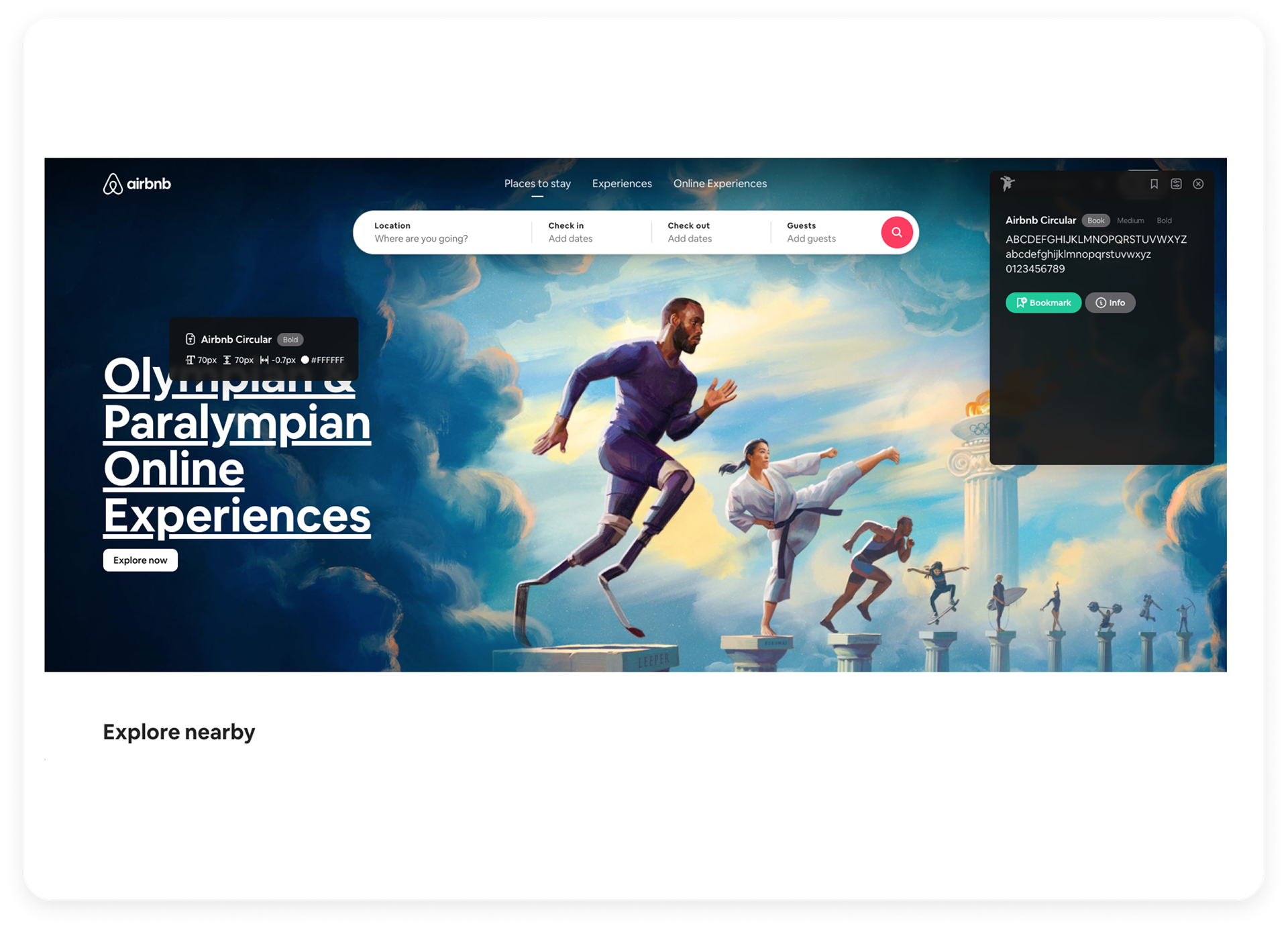
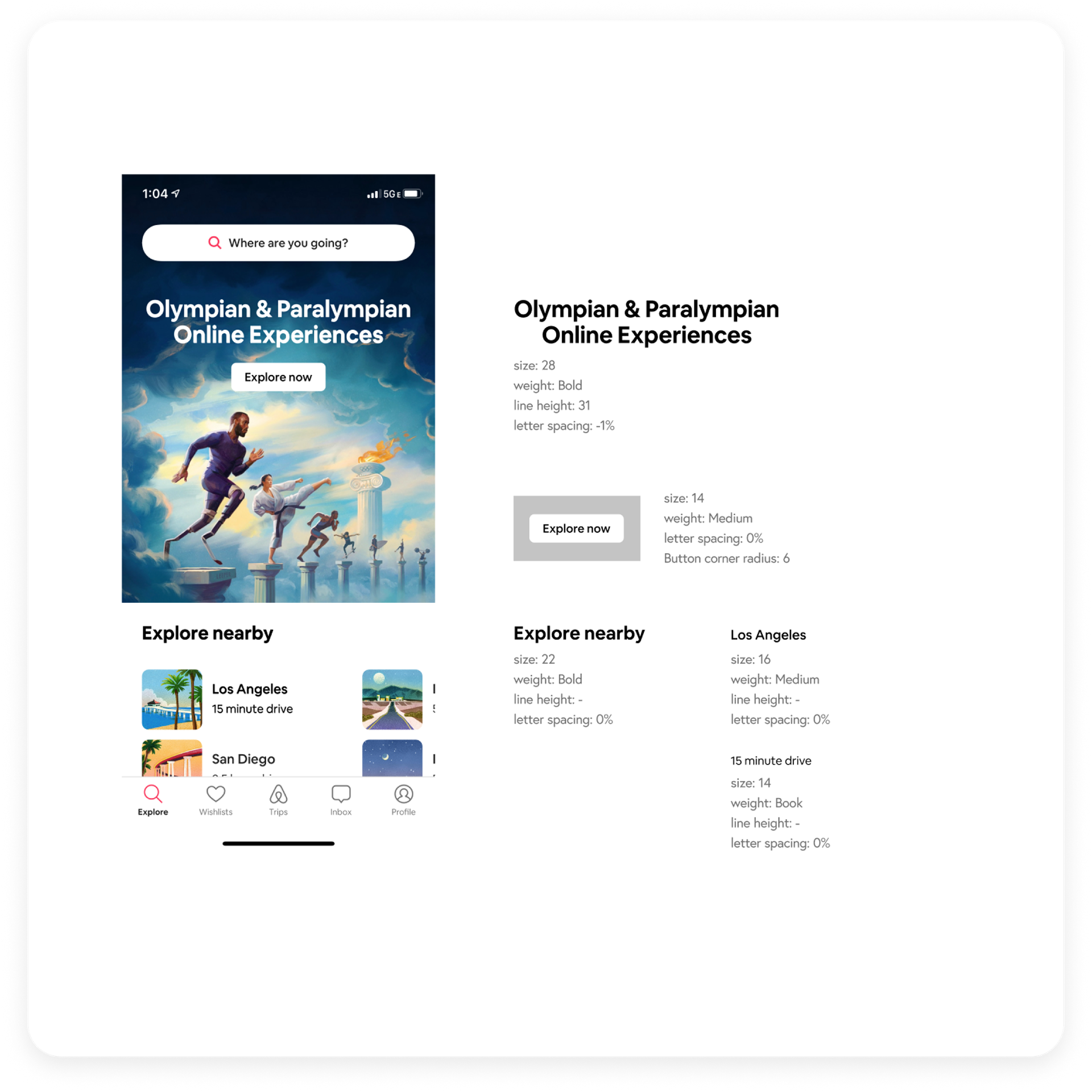
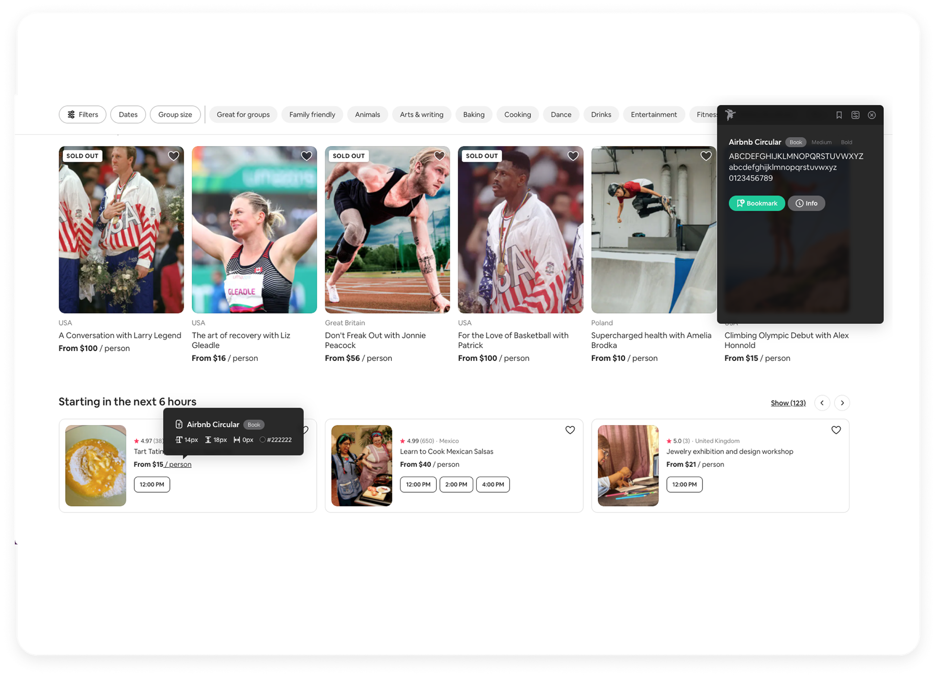
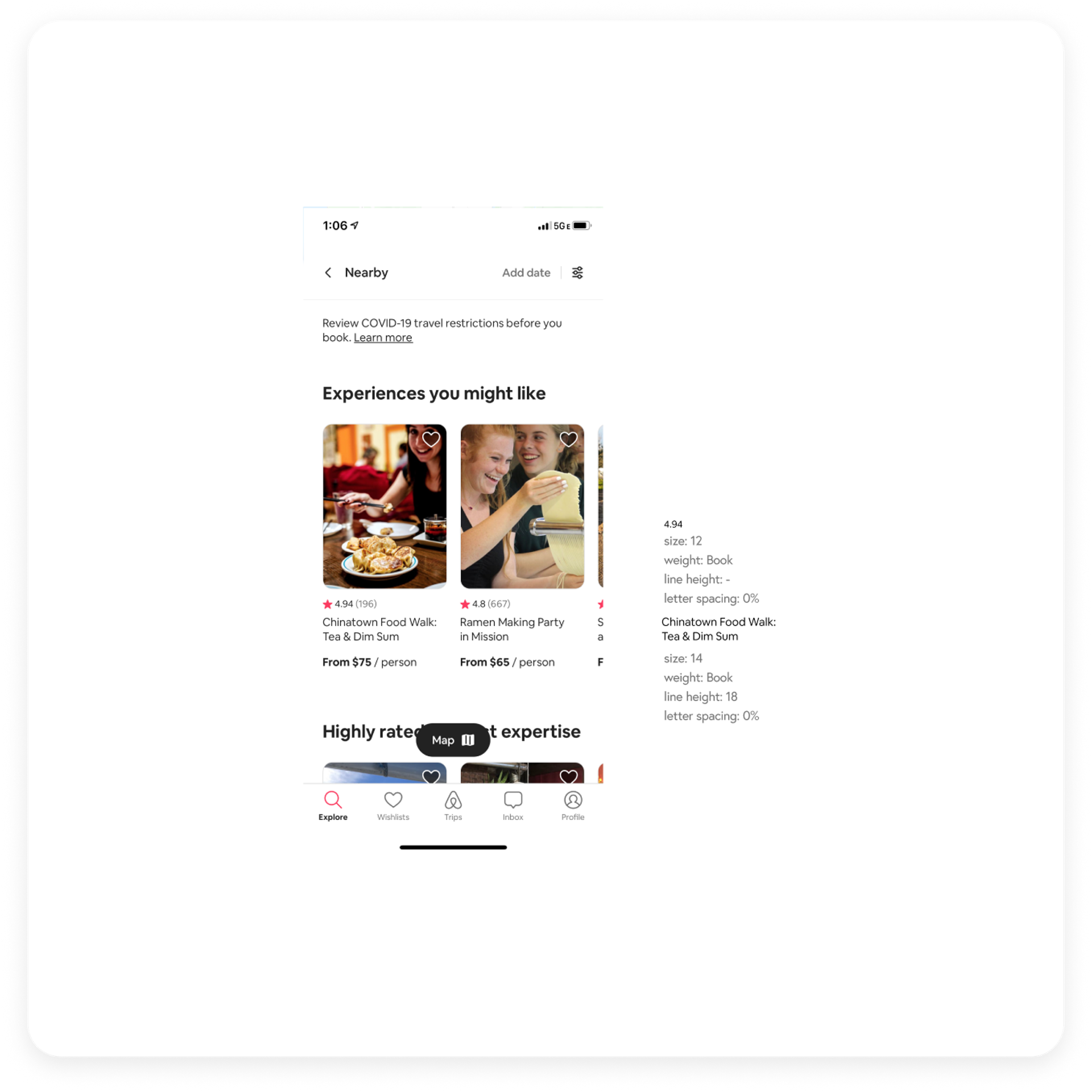
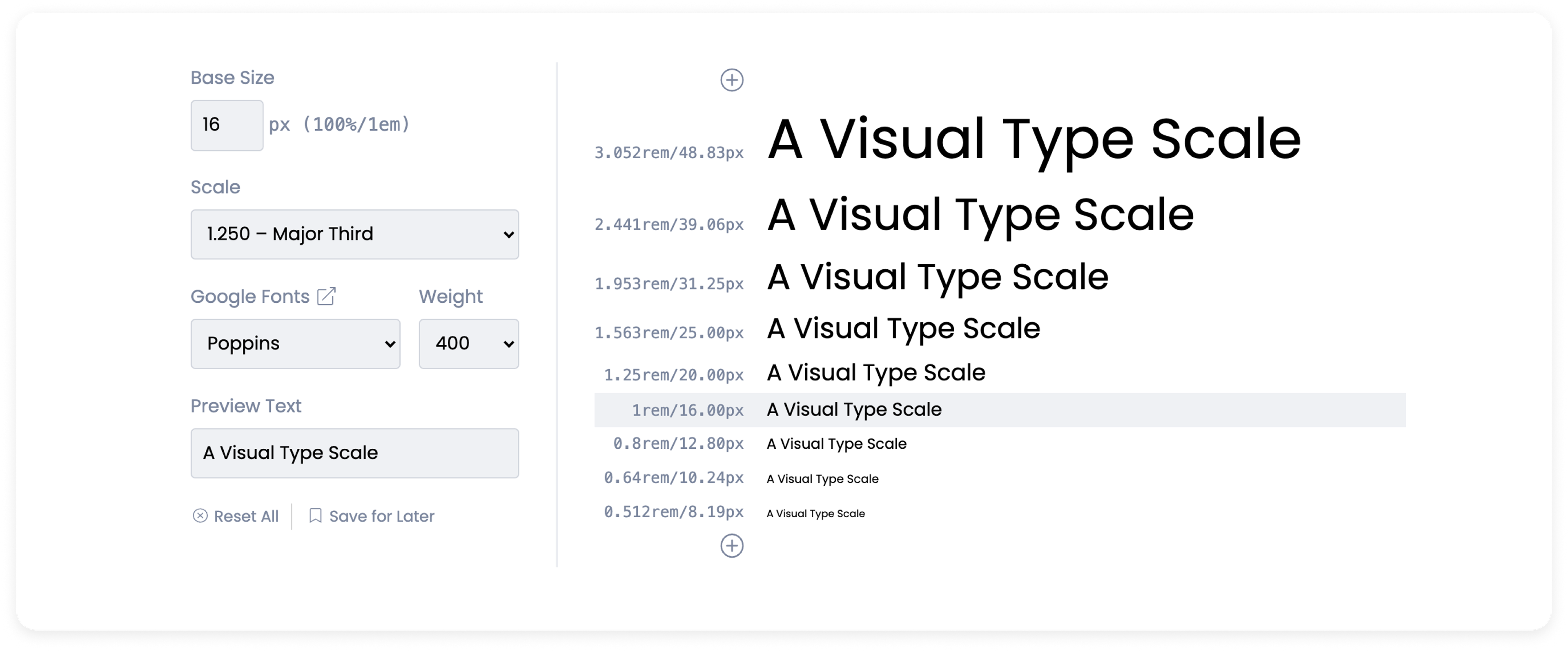
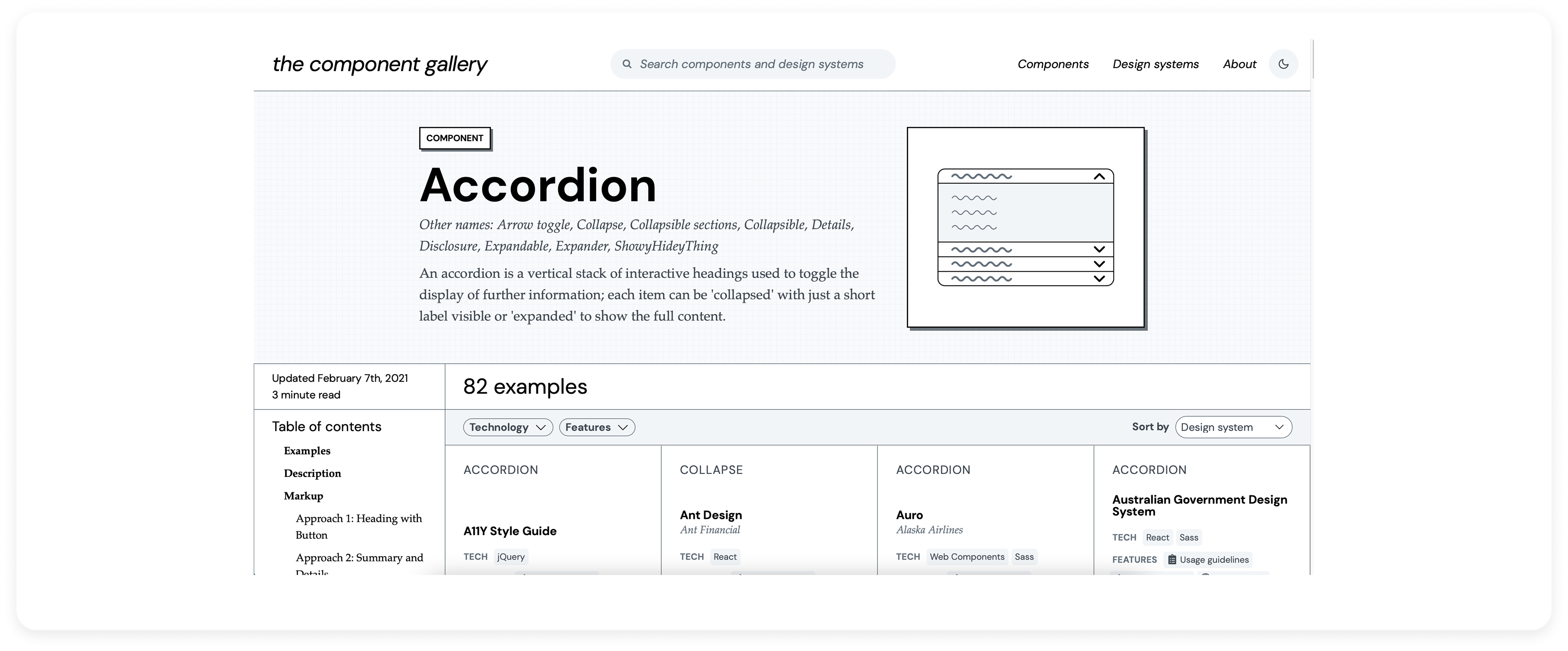
We loved the work of Jan Six, the creator of Figma Tokens. So much so, we reached out to him. I collaborated in the process of building it, and we committed to an Atomic design system using design tokens. Thanks Jan!
How Pasta works
Pasta is a "math-based" design system using design tokens to address all platforms. Our head of "Ops" created a framework to scale as much as we needed — we could now address iOS, Android, and Web with a single token apparatus, (separate from volatile design files). Our geometric and arithmetic scales can also round up values to make them clean "whole numbers" to fit in our 8 point grid system.
Don't think of Figma as the source of truth: it's simply another platform for us to inject design tokens. The benefit? Well, the entire Yummly platform can now change at the flick of a switch. Imagine the potential for A/B experiments and user tests...
We speak the language of engineers.
We painstakingly iterated on our taxonomy of tokens — remember, this was before tokens became a mainstream concept at all, and long before they existed in Figma.
Pasta houses the design tokens for access by engineers or designers, who inject them into their platform of choice.
"Modes" & "Themes" can be applied to components for rapid A/B testing. See our tokens at work below:
Modes: "Blueprint" mode for engineers to build, and Light & Dark mode for designers to pressure test.
Let's test our "Dialogue" component, and some buttons while we design.
If 50% of Pasta's in its structure & tokens, the other 50% is COLLABORATION.
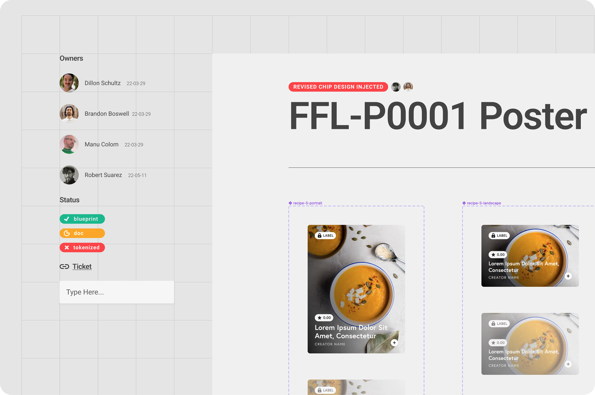
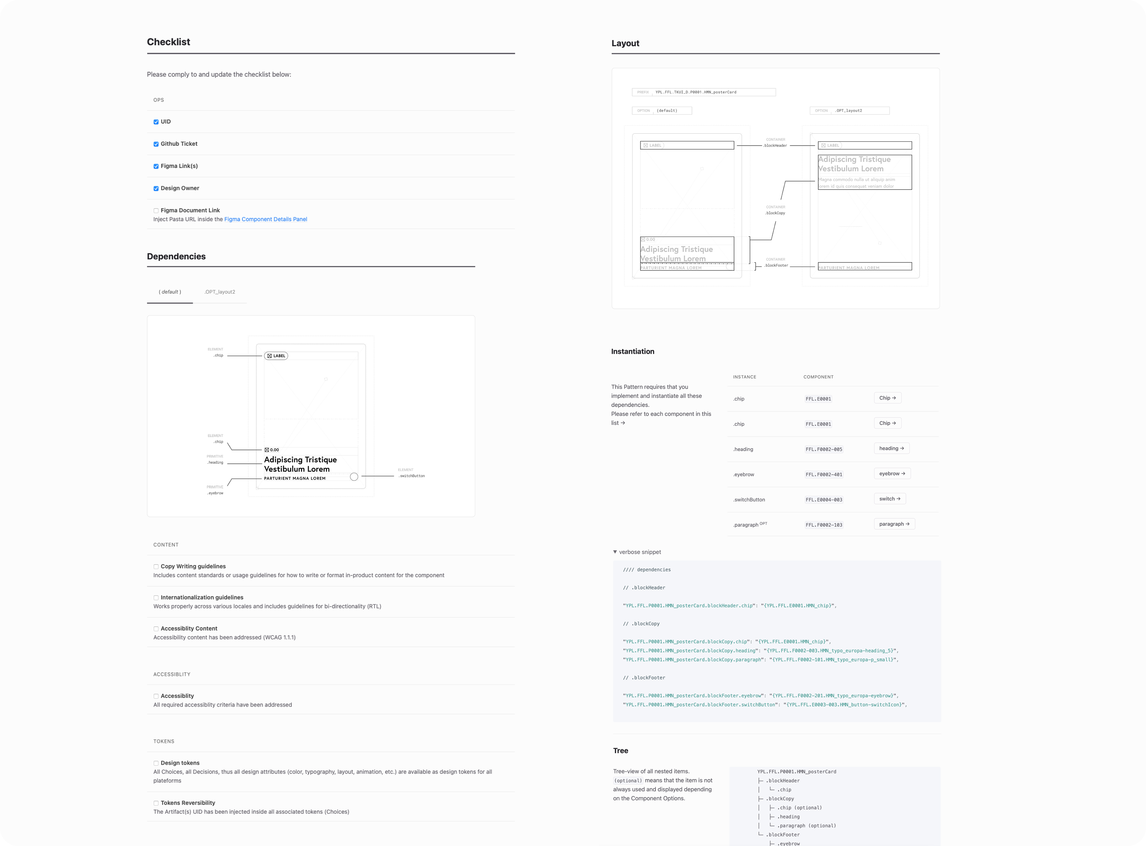
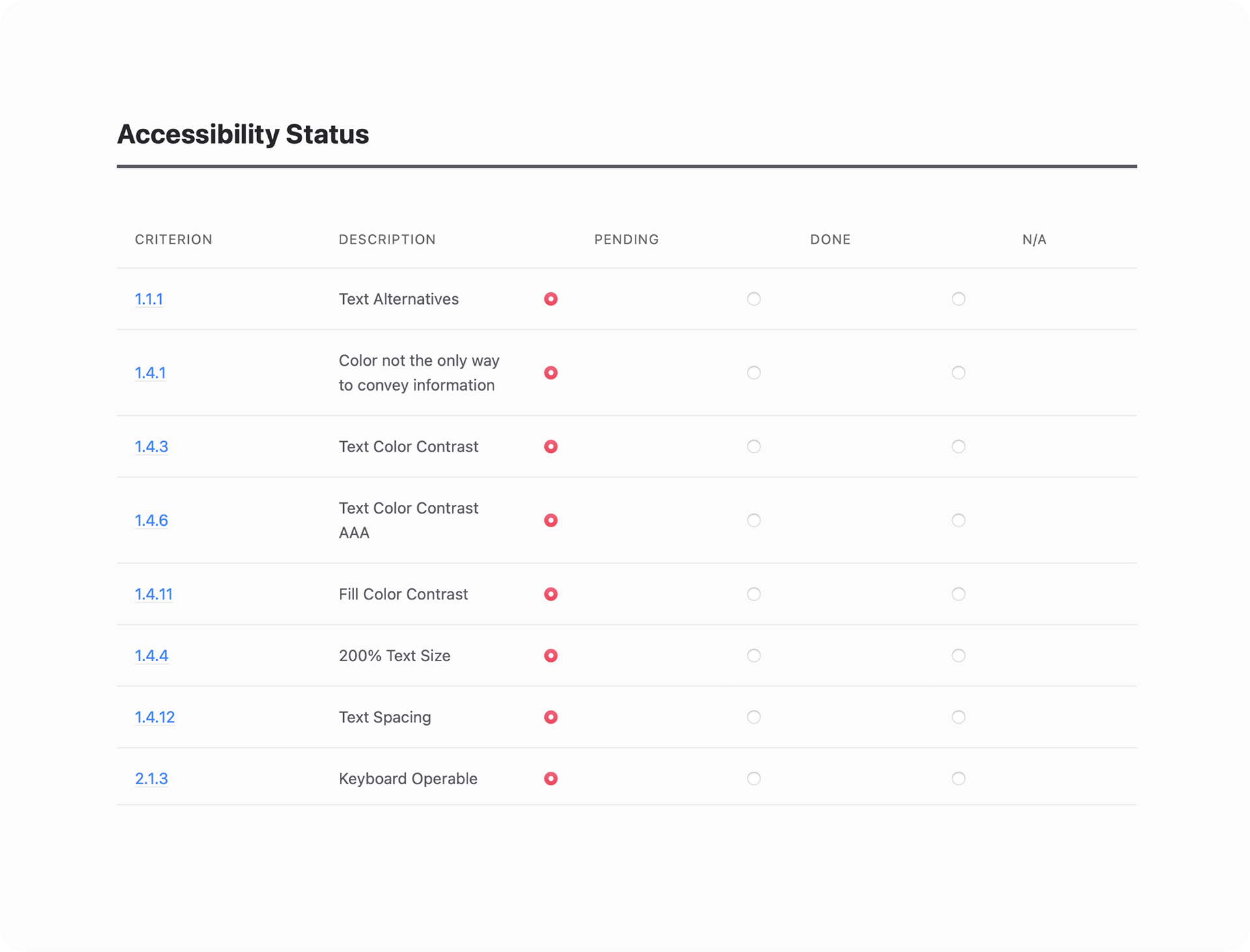
The whole team can keep tabs on the progress of individual Primitives, Elements, and Patterns. Here, development info, tokens, accessibility treatments, and next steps are addressed.
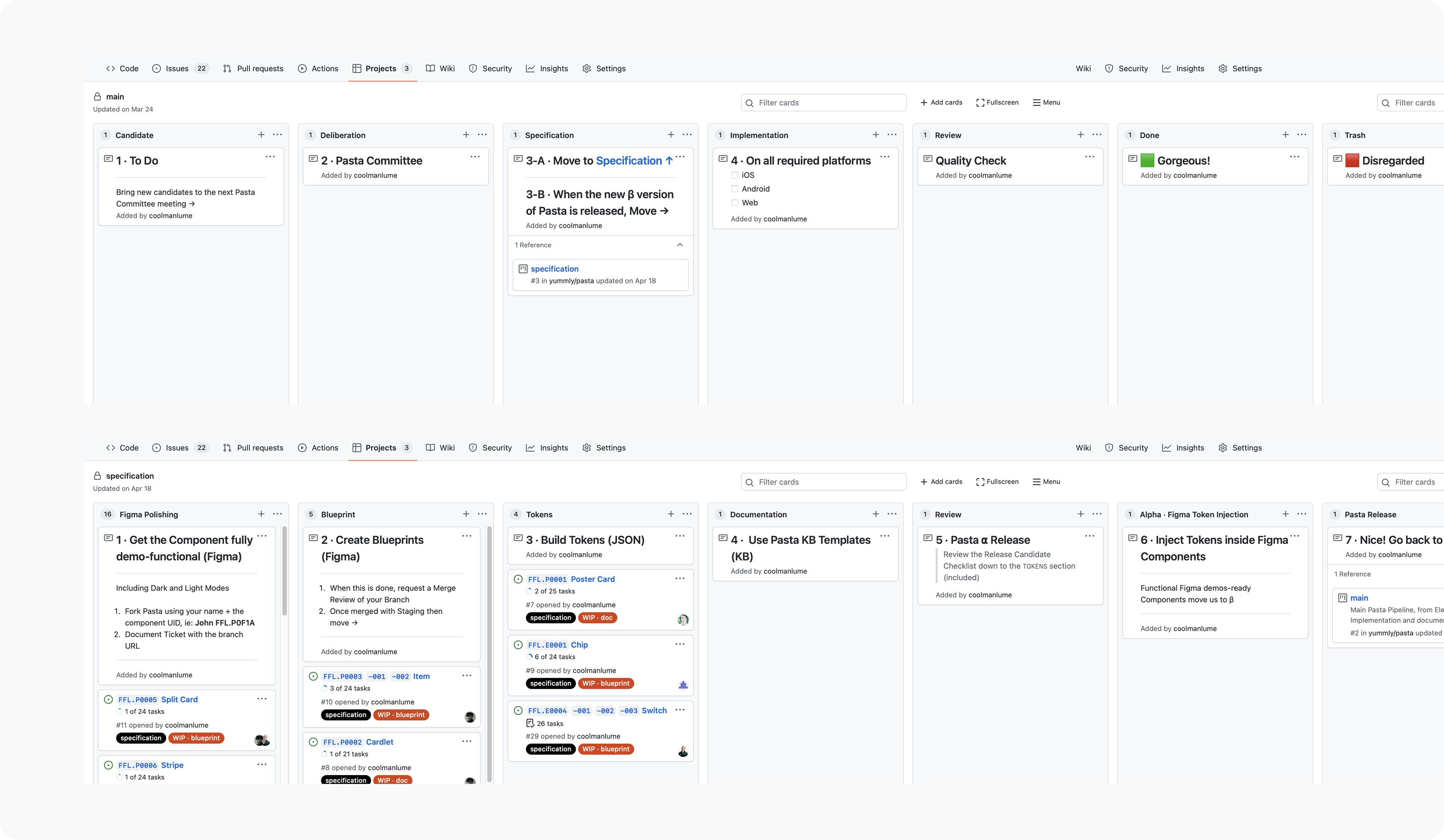
You are your daily routines — make the most of them. I helped plan our designer's weekly schedules in our new process.
Epilogue: Chef's Kiss
The Outcome
The future was set up to be a very personalized experience for users.
On the business end, we created a stable, responsive, and efficient foundation that scales at will — everybody wins.
What we accomplished:
• Cost of development dramatically reduced
• All engineers work off of a single source of truth (even further shortening time to ship new features and updates)
• All designers reference a centralized component library
• Users across North & South America enjoy a localized and WCAG accessible (AA + AAA) product
• Yummly Content Team now has consistent templates for all types of content
• Company rebrand currently being implemented successfully and efficiently
